Flooding From Irene Devastates Catskills Region

Flooding caused by Irene has been especially devastating to the Catskills Region in upstate New York. For residents of Hunter, Prattsville, Windham and the surrounding area, Irene was cataclysmic. Roads and bridges have been washed out while homes have been completely destroyed.

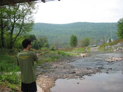
I have been visiting this area my whole life and I am as heartbroken by the devastation that those in the area must be feeling (visit this page for information on relief efforts) as I am fascinated by the power of nature that has been displayed by the Schoharie Watershed. Below are two pictures: the first is of yours truly on the south bank of the Batavia Kill in Ashland, NY in 2009. The second, taken recently, is of the same area but taken on the north side of the stream (along Route 23). The second picture shows a dramatic rise in water level, even a couple days after the storm with no additional rain.

The Batavia Kill, Ashland, NY (June 2009)

The Batavia Kill, Ashland, NY (A couple days post-Irene, August 2011)

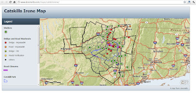
The transportation network in this area was obliterated by the flooding. Pictured below is a map (generated with ESRI products) showing impassable bridges, washed out roads in addition to shelters.

Lastly, below is a video that shows some of the damage in the towns across the region.

Creating a Simple Hurricane and Population Map in ArcMap

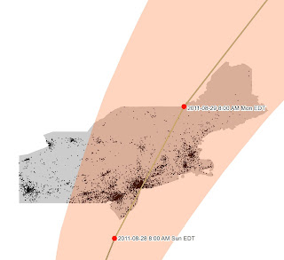
Irene’s projected path through the densely populated Northeast as of Thursday morning. 

Last week, I created a population density map with Hurricane Irene’s projected path overlayed for the CRE Blog. The following is a brief tutorial on how to do something similar…

1. Acquire Data – For this map, I acquired three types of data: Shapefiles from the census delineating politcal boundaries, a spreadsheet containing population data and Hurricane Irene’s projected path. The two former datasets are from the US Census while the latter comes from NOAA.

1A. Acquire Tiger Shapefiles – Tiger Shapefiles, from the US Census, can be acquired here.

1B. Acquire Census Population Data – 2010 Census Population data can be found through the American Fact Finder. To specify the Geographies I want, I must select them in the Select Geographies window. I decided to use County Subdivisions (Towns) for Maine, Massachusetts, New Hampshire, New York, Pennsylvania, Rhode Island, and Vermont.

1C. Acquire Hurricane Irene Data – Hurricane GIS data can be found on the National Hurricane Center website.

2. Join Population Data and Tiger Shapefiles – After acquiring the population shapefiles and data table, it is necessary to join the two. This must be done for all the towns, except for Connecticut. For the towns in CT, I downloaded (pre-joined) shapefiles from MAGIC’s GIS data page.

In order to join the non-CT shapefiles and data tables, I must use the Join dialog box (Right-click on the layer in your table of contents, “Joins and Relates”, “Join..”). In this box, select the common field for both your shapefile, and data table; for this exercise it is the “GEOid” field. It may be necessary to open the attribute table of your shapefile and data table independently to determine the common field. Because my data is in individual shapefiles by state, I must repeat this step for each of the states.

3. Symbolize Layers – Once the population data and shapefiles are joined, they are ready to be symbolized. I chose to create a dot density map based on total population. This is done under the Layer Properties.

Dot Density is found under Quantities on the left side of the dialog box; more than one field can be symbolized at once as long as it is a part of the attribute table of the respective shapefile you are working with. Again, because my data is in individual shapefiles by state, I must repeat this step for each of the states.

This is the point at which I symbolized my point, line and polygon hurricane layers, respectively. These were more straightforward: I used a single symbol (under Features) in the Symbology tab of the Layer’s Properties.

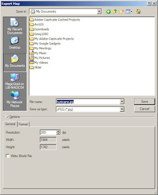
4. Export as .JPEG – Lastly, since my map was intended for web display, I chose to export it as a .JPEG (although you could also choose other common image files such as .PDF or .PNG). This can be done in the Export… dialog box which is accessed through the File tab of ArcMap.
CL&P’s Power Outage Map

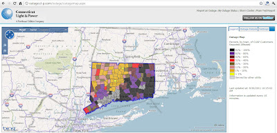
Hurricane/Tropical Storm Irene wreaked havoc upon the electrical infrastructure in Connecticut this past weekend. If, like me, you are without power at home still (UConn is back to near full power), you are probably wondering when electrical services will return. Unfortunately, it could take a while. Judging by CL&P’s Outage Map (pictured above), more than half of the eastern part of Connecticut is still without power.

Mapping Hurricane Irene

NOAA’s Google Map’s overlay shows Irene’s projected path.
Hurricane Irene is approaching the US mainland and NOAA is regularly updating their cartographic products to show the past, present and possible future locations and conditions of the storm. One such product is the Google Maps overlay pictured above. If you are interested in past storms, check out the Historic Hurricane Tracks application from NOAA which is pictured below.

Irene is projected to strengthen to a Category 4 storm in the next couple days while near the Bahamas. Watch this time-lapse video of satellite imagery (from NOAA) below to see Irene’s evolution to a Category 3 storm:

Where is the Recovery Act Funding ($780 Billion) Going?

An introduction to the American Recovery and Reinvestment Act.

In response to the economic downturn of late 2008, the American Recovery and Reinvestment Act was signed into law in February 2009 with the intent to create jobs and catalyze long term economic growth. Through this piece of legislation, hundreds of billions of dollars worth of contracts, grants and loans have been allocated to various organizations.

How money is allocated.

The massive amount of transactions have been tracked and made publicly available through Recovery.Gov. This site provides access to data related to the Recovery Act in addition to the ability to report abuses and fraud.

Click to open the Recipient Projects Map

Data is available in various formats including charts, interactive maps, and tables.

An overview of the Recovery.Gov maps.

For more information, like to see what projects have been funded for individual agencies or what projects have been funded near you, visit Recovery.Gov!

CNN’s Map of Unrest in the Arab World

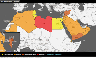
With reports of the Libyan Regime crumbling, today’s CNN homepage has prominently displayed an interactive map of information regarding political instability in the Arab World. The map has countries symbolized by categories (Post-Revolution, Civil War, Sustained Violence, and Protests) and includes and a description of events that have occurred in each respective country.