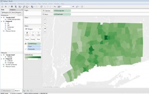
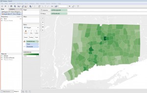
This is the first in a series of posts on using Tableau Desktop or Tableau Desktop Public Edition to visualize Connecticut data with custom polygons, which let Tableau create filled maps for geographic entities not recognized innately in the software’s mapping functionality. See these other posts for more information on creating choropleth/filled maps for Connecticut Census Tracts and school districts in Tableau:
- Mapping Connecticut Census Tract data in Tableau
- Mapping Connecticut School District Data in Tableau
Tableau can instantly recognize and map the boundaries of many types of geographic entities (e.g. states, counties, countries) – but for states like Connecticut with town-based governments, displaying town-level data on a map in Tableau isn’t quite as easy. Fortunately, a workaround exists that allows Tableau users of town-level data to create custom polygons maps to represent these areas. Tableau support documentation on this feature includes instructions on converting ArcGIS shape files into spreadsheet files that Tableau can use to construct custom polygon maps.
The Connecticut State Data Center has converted a number of U.S. Census Bureau TIGER/Line shape files into polygon data files for use in Tableau, including polygon files for Connecticut towns, school district, Census tracts, and legislative district boundaries. If you would like to visualize Connecticut town-level data on a map (as in this dashboard) in Tableau, this Excel workbook of Connecticut town polygons:
CT_Town_Polygons_for_Tableau.xlsx
contains a Polygon spreadsheet that will render a map of Connecticut towns in Tableau, and an additional sheet of town tax mill rate data that you can link with the polygon map (following the steps below, to create a choropleth map like this (click image to see full size):
Each row of the Excel Polygon sheet describes a single point on the outline of a single Connecticut town’s boundaries, with a field for longitude and latitude of the point. Another field for each row is Point Order, which tells Tableau in which order to ‘connect the dots’ to form each town’s boundaries on the map. For example, Mansfield’s shape has 208 points in the data set. Tableau draws each polygon by starting with the latitude and longitude of point 1, then continues drawing the shape until it gets to point 208, completing the outline of the town. The software does this for all 16,000+ points on the map instantly, whether in Tableau Desktop or Public, and map tools seem to work as quickly with a polygon map published to Tableau Public as any boundaries innately recognized in Tableau. Amazing, and really useful, functionality!
Setting up the polygon map:
- Save a copy of the Excel workbook of Connecticut town polygons locally. In Tableau Public or Desktop, from the Data menu navigate to the workbook and drag the Polygons sheet into the data space. Click Go to Worksheet or open a new New Sheet on the task bar.
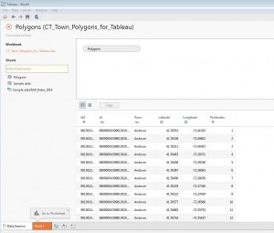
- Under Measures in the Data pane, drag Longitude to the Columns shelf. Note that the Aggregation for this pill should be average; i.e. the pill should say AVG(Longitude). Aggregations can be changed if necessary (e.g. from Sum to Average) from the carrot menu for the measure in the rows or columns shelf.
- Drag Latitude to the Rows shelf. The aggregation should also be average (AVG) in the pill.
- In the Marks card, change the view type menu from Automatic to Polygon
- If Pointorder appears in the Measures pane, it must be converted to a Dimension – simply drag it from Measures to Dimensions. Then, drag Pointorder to Path on the Marks card. (Don’t panic, it is normal to see a strange Rorschach test-like image on the map at this stage! Until we tell Tableau that we want Town to be the level of detail, it’s plotting the average latitude/longitude of each Pointorder value for all the rows in the data set, resulting in a bizarre polygon approximately where Madison is).
- Drag Town from Dimensions and place it on Color on the Marks card. (Select Add all members in the dialog window).
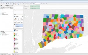 You should now see the outlines of all 169 Connecticut towns (click the image above to see the full view) and you can now link or join this base map to other data following steps in either Option 1 or Option 2 below.
Linking the custom polygon map to town-level data
Option 1 – connecting separately to the data source
- From the Data menu, New Data Source
- Navigate again to the to the CT_Town_Polygons_for_Tableau.xlsx workbook. Drag the Sample data sheet into the data area. Then return to the sheet on the taskbar in Tableau where you created the map.
- Because the Sample data sheet has a Town column, Tableau should indicate that the new data sheet has been joined to the Polygon sheet by the common Town field (with the chain icon as in the Dimension pane below). If your data source has a variation on this field label (e.g. County Subdivision instead of Town) from the Data menu go to Edit Relationships and add a custom join based on the common fields)
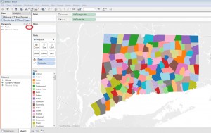
- In the map above, Town is on Color on the Marks card. We want to create a choropleth map based on the Millrate measure, but we want to keep Town in the visualization, letting Tableau that town is the unit of analysis or “level of detail”. Move Town from Color onto Detail on the Marks card. You should see a the outline of the state but the state is changed to a solid color.
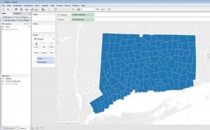 (If you like, you can show the borders of the towns as in the image above by selecting a Border color from the Color menu on the Marks card: Click Color, then under Effects change Border from Automatic to a color. This step isn’t necessary, but illustrates that Tableau really is showing the individual towns at this point)
 - Now drag the measure you want to show on the map, e.g. Millrate if you’re using the Sample data, to Color on the Marks card.
Option 2 – join the polygon sheet with the data sheet
Joining the Polygon sheet with the data sheet is what Tableau recommends in its support pages and may improve performance with some data sets. (It may not be the best option if your data sheet includes data for multiple years for each town.)
- Drag down on the Data menu, and from the carrot menu for the Polygons (CT_Town_Polygons_for_Tableau) data source select Edit Data Source. Drag the Sample data sheet into the data workspace.
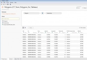
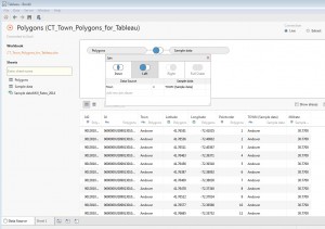
- Normally you will want to join the Polygon sheet with your data sheet using a Left join. Click on the venn diagram in the data workspace to bring up the Join dialog box. Click on the image illustrating Left join. The Polygon Data Source sheet should be joined to the Sample data sheet with the join clause Town = Town (Sample data):
Hope these instructions are helpful – your comments, corrections or suggestions are welcomed!
Steve Batt
steven.batt@uconn.edu

