State lottery system revenue and expenditures, 2014

This dashboard highlights another table available through the U.S. Census Bureau’s American FactFinder data portal:  Income and Apportionment of State-Administered Lottery Funds: 2014 from the 2014 State Government Finances data program.

The data – which includes total revenues of lottery systems, expenditures in lottery system administration and prizes, and total lottery revenue made available to fund state government – show a wide range of both public participation and approaches to state lottery administration among the 43 state lottery systems.

Compared with figures from the 2014 American Community Survey, Massachusetts had the highest lottery revenues from its adult population on a per-capita basis – about $900 of revenue for each adult 18 and over. Massachusetts also had the highest rate of payout to winners – returning  72% of gross lottery revenues in the form of prizes.  25.6% of Massachusetts state lottery revenues were made available to the state, compared with the national average of 34.6% – yet the state still ranked 4th in total lottery proceeds made available to finance other state functions – yielding more than $1.2 billion to the state in 2014.

Arkansas had the lowest percentage of lottery revenues returned to state government – 20.4% – and was the 12th most costly state system to run in terms of lottery administrative costs as a percentage of gross lottery revenue. West Virginia lottery system allocated the smallest percentage of gross lottery revenue on prizes – 17.1% – and returned the highest percentage of lottery  revenue back to the state – 77.8% –  to be made available for other government functions.


[xyz-ihs snippet=”State-lottery-funds-2014″]

Mapping Connecticut School District Data in Tableau

This is the third in a series of posts on using Tableau Desktop or Tableau Desktop Public Edition to map Connecticut data using custom polygons, to accommodate geographic entities not recognized innately in the Tableau mapping functionality. See these other posts for more information on creating filled maps for Connecticut towns and Census Tracts in Tableau:

Tableau and Tableau Public offer robust mapping capabilities, including the ability to recognize geographic entities in your data and instantly create choropleth (filled) maps with shapes for counties, states, and countries. For users that want to create filled maps for geographic entities not recognized innately by the software, Tableau supports the creation of polygon-shaded maps, allowing users to map data onto polygon shapes which correspond to sales regions, marketing areas, etc. The Connecticut State Data Center has created a number of custom polygon map files corresponding to Connecticut geographies not innately supported in Tableau, including Connecticut school districts:

CT_School_District_Polygons_for_Tableau

The directions below show you how to connect to this file to create a custom polygon map for school districts, and then join the Polygon data with some sample demographic data from the American Community Survey to create a filled/choropleth map. This is followed by additional tips to joining the polygon shapes with additional data sources, such as data from Connecticut Open Data, CTDataCollaborative, and Connecticut Department of Education.

Step 1: Setting up the School District polygon map:

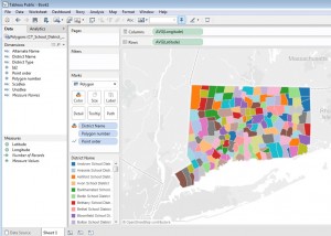
  1. Save a copy of the CT_School_District_Polygons_for_Tableau Excel workbook (linked above) to your computer. Open Tableau Public or Desktop, and from the Data menu navigate to the Excel workbook, and drag the Polygons sheet into the data space. Click Go to Worksheet or open a new New Sheet on the task bar.connecting
  2. Under Measures in the Data pane, drag Longitude to the Columns shelf. Note that the Aggregation for this pill should be average; i.e. the pill should say AVG(Longitude). Aggregations can be changed if necessary (e.g. from Sum to Average) from the carrot menu for the measure in the rows or columns shelf.
  3. Drag Latitude to the Rows shelf. The aggregation should also be average (AVG) in the pill.
  4. In the Marks card, change the view type menu from Automatic to Polygon
  5. If Pointorder was placed in the Measures pane, it must be converted to a Dimension – simply drag it from Measures to Dimensions. Then, drag Pointorder to Path on the Marks card.
  6. Drag Polygon Number onto Detail on the Marks card.
  7. Drag District Name from Dimensions onto Color on the Marks card. (If a dialog window appears, confirm that you want to Add all members).
  8. To see the boundaries of districts more clearly, it is helpful to display borders around the polygons. To do this, click Color on the Marks card, and from the Border carrot menu, select a color. You should now see a map like this:map
  9. At this point, it’s important to note that mapping Connecticut school district data is a little tricky, because the varying administrative structures among districts creates overlapping geographies that makes it impossible to show all districts on a single map. There are three basic administration models for school districts in Connecticut, and geographically speaking, they aren’t mutually exclusive – as many towns send children to more than one district. Here are the three types (the names of the district types are from the Census Bureau (which publishes the shape files from which the polygons are derived); and may not correspond to local or state terminology):

Continue reading

Mapping Connecticut Census Tract data in Tableau

This is the second in a series of posts on using Tableau Desktop or Tableau Desktop Public Edition to map Connecticut data using custom polygons, to accommodate geographic entities not recognized innately in the Tableau mapping functionality. See these other posts for more information on creating filled maps for Connecticut towns and school districts in Tableau:

The U.S. Census Bureau aggregates and publishes Decennial Census and American Community Survey data at geographic levels large and small, including Census Tracts – small statistical subdivisions of roughly 1200-8000 people. Connecticut has 833 Census tracts; many small towns comprise a single Census Tract, while Hartford has more than 30. There are more than 7,500 data tables available through American FactiFinder for Connecticut Census tracts on demographic and economic measures including income and poverty, educational attainment, health insurance coverage, housing characteristics, and more. The steps below will let you create a choropleth map in Tableau for any Census Tract-level data downloaded from American FactFinder, enhancing the functionality of Tableau to analyze and visualize ACS and Decennial Census data.

Tableau support documentation includes instructions on converting ArcGIS shape files into spreadsheet files that Tableau can use to construct custom polygon maps. The Connecticut State Data Center has converted a number of U.S. Census Bureau TIGER/Line shape files into polygon data files for use in Tableau, including polygon  files for Connecticut towns, school districts, Census tracts, and legislative district boundaries. If you would like to visualize Connecticut Census Tract-level data on a map (as in this dashboard) in Tableau, this Excel workbook:

CT_Census_Tract_Polygons_for_Tableau.xlsx

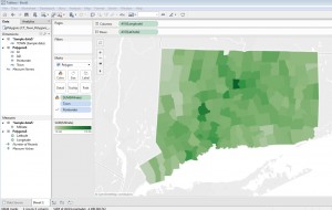
of Connecticut Census Tract polygons contains a Polygon spreadsheet that will render a map of all Census tracts within Connecticut, and an additional sheet of housing value data from the American Community Survey that you can link with the polygon map, following the steps below, to create a choropleth map like the one below (click image to see full size). Additional information will help you download more tract-level data from American FactFinder, and join and map it with the Polygon data.

8

Each of the 29,202 rows of the Excel Polygon sheet describes a single point on the outline of a single tract’s boundaries, with a field for longitude and latitude of the point. Another field for each row is Point Order, which tells Tableau in which order to ‘connect the dots’ to form each tract on the map. For example, Mansfield’s shape has 208 points in the data set. Tableau draws each polygon by starting with the latitude and longitude of point 1, then continues drawing the shape until it gets to point 208, completing the outline of the town. The software does this for all 29,000+ points on the map instantly, whether in Tableau Desktop or Public, and map tools seem to work as quickly with a polygon map published to Tableau Public as any boundaries innately recognized in Tableau.

Step 1: Setting up the polygon map:

Continue reading

142 counties – with 92 million residents – experienced a significant increase in income inequality from 2008-2013

According to the U.S. Census Bureau’s American Community Survey estimates, income inequality increased significantly in 142 U.S. counties between the 2008-10 and 2011-13 survey periods. While this is relatively small compared to the number of counties where there was no significant change (1,688), almost 92 million people – nearly 30% of the U.S. population at the time – resided in these counties in 2013. Eleven counties – with a combined population of 565,00 – had significantly reduced income inequality over the 2011-2013 ACS survey period, compared with 2008-2010. Click any county in the map below to see a link to the original ACS data in the American FactFinder data engine.

This visualization uses table B19083 Gini Index of Income Inequality  from the 2010 and 2013 ACS 3-Year Estimates and compares the values for each county, and their margins of error, between the survey periods. Counties with very close Gini Index values from the two surveys (where the confidence intervals overlap) are considered not to have experienced a statistically significant change in income inequality. Counties which have an upper bound of the 2008-10 confidence interval which is smaller than the lower bound of the 2011-13 confidence interval are considered to have had a statistically significant increase in income inequality income between the two survey periods. Conversely, those counties which have a lower bound of the 2008-10 confidence interval which is greater than the upper bound of the 2011-13 confidence interval are considered to have experienced a statistically significant decline in median household income.

The 3-Year Estimates data series (now discontinued) reported data for counties with populations of 20,000 or more, so counties with smaller populations are excluded from the analysis. The counties in the map below had an aggregate total population of 301 million in 2013, compared with the total U.S. population 314 million at the time. The release of the ACS 2011-2015 5-Year data set in December 2016 will allow similar analysis for all U.S. counties, including those with populations under 20,000. Data from this survey will be able to be compared to results from the 2006-2010 5-Year data.

The Gini Index represents the concentration of income in a given state or country, in a range from 0 to 1. A higher Gini index indicates greater inequality – where income is concentrated among a relatively few individuals or households; a lower Gini score represents more even income distribution. The Gini index is a commonly used economic measure, reported by organizations such as the World Bank and CIA, in its World Factbook.

[xyz-ihs snippet=”Change-in-GINI-index-in-US-counties”]

Change in median household income within U.S. counties between 2004-09 and 2010-14 American Community Surveys

This visualization compares county-level median household income from the 2004-2009 and 2010-2014 American Community Survey 5-Year Estimates and compares the confidence intervals of the surveys to determine whether there was a significant increase or decline in median household income between the surveys, or no statistically significant change. Estimates from the 2004-2009 survey were converted to 2014 inflation-adjusted dollars using the Bureau of Labor Statistics’ ‘Consumer Price Index – All Urban Consumers‘ benchmark. These adjusted figures were compared with the median household estimate from the 2010-14 ACS (which were originally published in 2014 inflation-adjusted dollars).

Counties with inflation-adjusted median household income estimates with overlapping margins of error between the two surveys (when both survey estimates are expressed in 2014 inflation-adjusted dollars) are considered not to have experienced a statistically significant change in median household income between the survey periods. Counties which have an upper bound of the 2004-2009 confidence interval which is smaller than the lower bound of the 2010-2014 confidence interval, are considered to have had a statistically significant increase in median household income between the two survey periods. Conversely, those counties which have a lower bound of the 2009-2014 confidence interval which is greater than the upper bound of the 2010-2014 confidence interval are considered to have experienced a statistically significant decline in median household income.

The American Community Survey data showed statistically significant increase in median household income in 88 counties between these survey periods; 2,378 showed no significant change, and 677 a statistically significant decrease in median household income. Notably, the majority of the U.S. population lives in the counties that showed a significant decrease in household income: according to the 2014 ACS population figures, about 202 million people – 64% of the U.S. population – resided in these 677 counties.

Note that this visualization’s inflation adjustment uses national level Consumer Price Index, which may not reflect inflation differences that exist across geographies or regional differences in housing, transportation, or other sectors. The American Community Survey confidence intervals used here are the originally published data, which was reported at a 90% confidence interval.

[xyz-ihs snippet=”Change-in-median-household-income-by-County”]