This is the third in a series of posts on using Tableau Desktop or Tableau Desktop Public Edition to map Connecticut data using custom polygons, to accommodate geographic entities not recognized innately in the Tableau mapping functionality. See these other posts for more information on creating filled maps for Connecticut towns and Census Tracts in Tableau:
- Mapping Connecticut Census Tract data in Tableau
- Creating a custom polygon map for Connecticut towns in Tableau
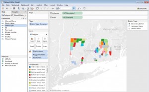
Tableau and Tableau Public offer robust mapping capabilities, including the ability to recognize geographic entities in your data and instantly create choropleth (filled) maps with shapes for counties, states, and countries. For users that want to create filled maps for geographic entities not recognized innately by the software, Tableau supports the creation of polygon-shaded maps, allowing users to map data onto polygon shapes which correspond to sales regions, marketing areas, etc. The Connecticut State Data Center has created a number of custom polygon map files corresponding to Connecticut geographies not innately supported in Tableau, including Connecticut school districts:
CT_School_District_Polygons_for_Tableau
The directions below show you how to connect to this file to create a custom polygon map for school districts, and then join the Polygon data with some sample demographic data from the American Community Survey to create a filled/choropleth map. This is followed by additional tips to joining the polygon shapes with additional data sources, such as data from Connecticut Open Data, CTDataCollaborative, and Connecticut Department of Education.
Step 1: Setting up the School District polygon map:
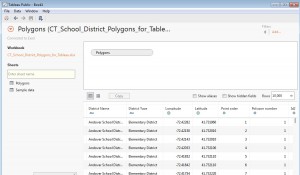
- Save a copy of the CT_School_District_Polygons_for_Tableau Excel workbook (linked above) to your computer. Open Tableau Public or Desktop, and from the Data menu navigate to the Excel workbook, and drag the Polygons sheet into the data space. Click Go to Worksheet or open a new New Sheet on the task bar.
- Under Measures in the Data pane, drag Longitude to the Columns shelf. Note that the Aggregation for this pill should be average; i.e. the pill should say AVG(Longitude). Aggregations can be changed if necessary (e.g. from Sum to Average) from the carrot menu for the measure in the rows or columns shelf.
- Drag Latitude to the Rows shelf. The aggregation should also be average (AVG) in the pill.
- In the Marks card, change the view type menu from Automatic to Polygon
- If Pointorder was placed in the Measures pane, it must be converted to a Dimension – simply drag it from Measures to Dimensions. Then, drag Pointorder to Path on the Marks card.
- Drag Polygon Number onto Detail on the Marks card.
- Drag District Name from Dimensions onto Color on the Marks card. (If a dialog window appears, confirm that you want to Add all members).
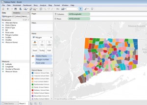
- To see the boundaries of districts more clearly, it is helpful to display borders around the polygons. To do this, click Color on the Marks card, and from the Border carrot menu, select a color. You should now see a map like this:
- At this point, it’s important to note that mapping Connecticut school district data is a little tricky, because the varying administrative structures among districts creates overlapping geographies that makes it impossible to show all districts on a single map. There are three basic administration models for school districts in Connecticut, and geographically speaking, they aren’t mutually exclusive – as many towns send children to more than one district. Here are the three types (the names of the district types are from the Census Bureau (which publishes the shape files from which the polygons are derived); and may not correspond to local or state terminology):
- Unified school include traditional town-based districts which administer schools for all grades K-12 in their town; most medium- and larger-sized towns in Connecticut fall under this category. However, Unified districts also include regional districts which administer schools at all levels within their member towns. (For example, Regional District 17 includes all elementary, middle, and high schools in Haddam and Killingworth).
- Elementary districts administer only K-6, or K-8, schools – such as the Mansfield School District, which administers elementary schools and a middle school. These districts send their high-school aged students to a regional high school (Regional District 19, in the case of Mansfield) where they join students from other towns.
- Secondary districts are Regional districts 1,4,5, 7, 8, 9, 11 and 19, which consist only of high schools. These districts include towns which administer their own k-6 or k-8 schools, but share a regional high school with neighbor towns. Regional School District 19, for example, is a single high school shared by Mansfield, Ashford, and Willington students.So, how can we handle these overlapping geographies in Tableau? We could either break out the district types onto 3 separate maps, or use a Tableau Quick Filter on the District Type dimension, making the user view a single district type at a time. To set this up, click District Type in the Dimensions pane, and from the carrot menu select Show Quick Filter. A District Type check box menu should appear adjacent to the map. Finally, we’ll alter the menu to make it so the user can only display a single District Type at one time. Click the carrot next to the District Type title in the Quick Filter, and change the menu type from Multiple Values (List) to Single Value (List). Now, click the carrot once again to return to the same menu, and from the Customize menu, uncheck the Show “All” value selection. You map should now look like this, and is ready to display data:
Step 2: Linking the custom polygon map to school district-level data
Here we’ll link to the Sample data sheet in the Excel workbook, containing data on the number of families below the poverty level within school districts, to get the hang of connecting the polygon map to actual data which we want to visualize. There are two ways to do this:
Option 1 – connecting separately to the data source
- From the Data menu, New Data Source
- Navigate again to the local copy of the CT_School_District_Polygons_for_Tableau.xlsx workbook. Drag the Sample data sheet into the data area. Then return to the sheet on the taskbar in Tableau where you created the map.
- Because the Sample data sheet has an Id2 column, Tableau should be ready to join the Sample data with the Polygon sheet by the common Id2 field. Click the chain icon, circled in the Dimension pane below, to set up this relationship:
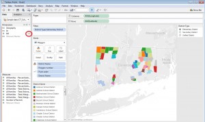
- In the map above, District Name is on Color on the Marks card. We’ll want to create a choropleth map based on one of the measures in the Sample data data source, but we will still need to keep the School District dimension in the visualization, letting Tableau that School District is the unit of analysis or “level of detail”. Move District Name from Color onto Detail on the Marks card. You should now see the districts are the same color, but still outlined:
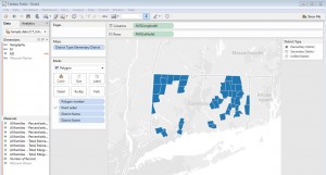
- Now drag any measure you want to show on the map, e.g. ‘All families- percent below poverty level; Estimate; With children under 18‘ onto Color on the Marks card to create a filled map.
Option 2 – join the polygon sheet with the data sheet
Joining the Polygon sheet with the data sheet is what Tableau recommends in its support pages and may improve performance with some data sets. (It may not be the best option if your data sheet includes data for multiple years for each school district.)
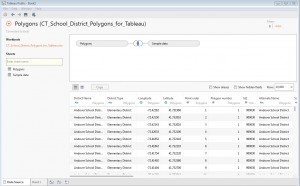
- Drag down on the Data menu, and from the carrot menu for the Polygons (CT_School_District_Polygons_for_Tableau) data source select Edit Data Source. Drag the Sample data sheet into the data workspace:
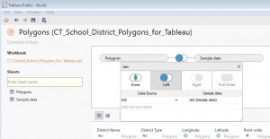
- Normally you will want to join the Polygon sheet with your data sheet using a Left join. Click on the venn diagram in the data workspace to bring up the Join dialog box. Click on the image illustrating Left join. The Polygon Data Source sheet should be joined to the Sample data sheet with the join clause Id2 = Id2 (Sample data):
- Follow steps 4 & 5 above to create the filled map.
Tips for connecting the school district polygons to additional data sources:
There are many great data sources that can be joined with the Polygons file to map CT school district data visualizations in Tableau:
- Connecticut Data Collaborative offers a great selection of school district data on Connecticut school districts. Check out their collection of Raw Data for Department of Education datasets at the school district level, including special education, mastery test results, and more. Instead of joining files from CTdata.org with the Polygon sheet on the Id2 field, try joining the District field in the CTdata.org data with the Alternate District Name field in the Polygons sheet. (The difference between the District Name and Alternate Name fields in the Polygon data is that the Alternate Name column contains commonly-used names for the secondary school districts, i.e. Regional School District 19 instead of the slightly different name assigned by the Census Bureau: Regional High School District 19).
- Connecticut Open Data provides a growing number of datasets from the State Department of Education on district-level enrollment, absenteeism, standardized tests, and more. As with CTdata.org data, use the Alternate Name field in the Polygons sheet to join it with the District Name field in datasets from Connecticut Open Data.
- Connecticut State Department of Education EdSight data portal includes fiscal data, staffing levels, student and instructor demographics, graduation rates, standardized test scores, and more. Use the Alternate Name field in the Polygons sheet to join it with the District Name field in datasets downloaded from EdSight.
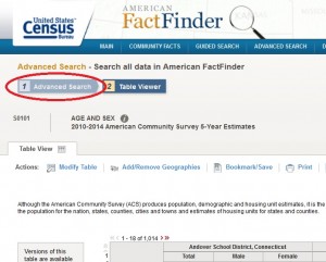
- The U.S. Census Bureau’s American FactFinder data portal provides close to 15,000 data tables for Connecticut school districts from various Census Bureau programs, including the 2000 and 2010 Decennial Census, the American Community Survey, and the Annual Survey of School System Finances. Use this bookmarked table as a starting point. Above the Age and Sex table, click the Advanced Search button (circled below). This will take you to the main American FactFinder search page, and all Connecticut school districts are pre-selected in the Your Selections window.
Use the Topics menu to browse a subject index of population, demographic, and economic tables at the school district level. To download tables you’ve located, from the Table, File, or Document Title results window, put a check next to the table ID to select any table or tables, and use the Download icon above the list to download the table(s) for all selected geographies in a .csv format that Tableau will be happy with. Use the Id2 field in datasets downloaded from American FactFinder to join the data with the Polygons sheet, as we did with the Sample data sheet above.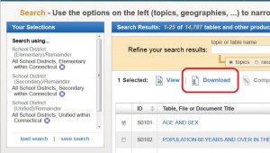
Hope these instructions are helpful – your comments, corrections or suggestions are welcomed!
Steve Batt
steven.batt@uconn.edu

