About Michael Howser

Michael serves as the Director of the Connecticut State Data Center and the Director of the UConn Library at Hartford Public Library.

Washington, D.C.: Then and Now

For a look into the past of Washington, D.C., check out the The Ruined Capitol Blog:

A photo depository and discussion dedicated to the comparison of buildings, culture, and society in Washington, D.C. that have been destroyed, replaced or miraculously preserved during the great architectural purge of the Federal City from 1930 to the 1980s.


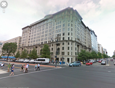
This blog features historical photos from locations in the nation’s capitol that show the evolution of its urban geography. It’s amazing to see some of these older photographs compared to their contemporary counterparts for a variety of reasons, but one is the difference in scale. An example of this can be seen in the two photographs below, at the intersection of K and 15th St NW (dated ca. 1922; Present). With wider roads and taller buildings, as the author notes, the urban design and architecture have given this location a tremendously different scale and sense of place.


The location of the intersection- courtesy of Google Earth:


For more of these before and after shots of D.C., visit The Ruined Capitol.


The Atlantic Cities: Bridgeport-Stamford-Norwalk 7th Healthiest Metro

The Atlantic Cities has ranked metropolitan areas using a health index with Bridgeport-Stamford-Norwalk, CT coming in as the 7th healthiest metro. As for other location in New England- Barnstable, MA came in 15th while Burlington, VT came in 20th. The majority of the most unhealthy metros, according to the index, are located in the South and Midwest. The index is based upon two health indicators: the level of smoking and obesity. For more, check out the full article.

State Transportation Facts and Figures

A screenshot of motor fuel use per capita from RITA’s State Transportation facts. Connecticut ranks 43rd out of 51 (Washington, D.C. is included).

The Research and Innovative Technology Administration of the U.S. Department of Transportation has released an interactive application, entitled State Transportation Facts and Figures, that allows you to explore transportation statistics by state. The statistics included fall under 7 categories:

  • Infrastructure
  • Fatalities and Injuries
  • Distracted Driving 
  • Freight Transportation
  • Passenger Travel
  • Economy and Finance
  • Energy and Environment

The data can be viewed as a map, bar chart, pie chart, or scatter chart, or, by clicking the various drop down menus of the application, you have the option of downloading the source data in addition to printing the various figures.

To view data for Connecticut, click here.

Mapping a Year in the Life of Boston

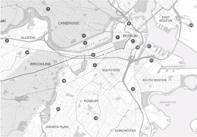
At the end of December, The Boston Globe ran this geographic narrative that mapped 17 events of 2011 in the city of Boston. Here are a few of my favorites:

  • 8. The puck stopped here – In June, the Bruins won their first Stanley Cup since 1972. Their victory sparked riots in Vancouver, home of their opponents. At home, the win was celebrated with a victory parade through downtown Boston.
  • 11. Whitey’s back – After 16 years on the lam, infamous South Boston gangster Whitey Bulger was captured in Santa Monica, Calif., and arraigned at Boston’s federal courthouse.
  • 12. Occupied! – The encampment in Dewey Square was one of the longest-lasting of the Occupy protests in major US cities. Protesters began the demonstration on Sept. 30; on Dec. 10, the camp was cleared by police, resulting in dozens of arrests.

CT GIS User to User Network Meeting – January 27

Mark your calendars and plan to attend the Connecticut GIS User to User Network Annual Business Meeting!
When: Friday, January 27, 2012
Time: 9:00am-12:00pm (networking begins at 8:30am with meeting beginning at 9:00am)
Location: MDC Training Center, 125 Maxim Road, Hartford  (http://www.themdc.com/2trainingcenter.htm for directions)
This meeting will include the following topics:
  • Election of Steering Committee members
    • Election of  a new president, secretary, utilities representative, non-profit representative, and member at large
  • Discussion on organization by-law revision
  • Presentation on Mobile Applications
If you are interested in becoming an active member of the steering committee (this can help with your GISP application!), please try to attend this meeting. If you have questions regarding steering committee obligation and related questions, feel free to contact Thad Dymkowski, or speak to a member of the current steering committee at the meeting.

A Geographic Look at the Proposed Keystone XL Pipeline: Where Does Tar Sands Oil Get Refined?

In the United States, the answer is a whole bunch of places (excluding the Eastern Seaboard). In the wake of President Obama’s rejection of TransCanada’s proposed route of the Keystone XL Pipeline, check out this map of refineries in the US that handle tar sands oil (pictured above; source: Mother Jones). As you can see, there are nearly 50 refineries who handle tar sands oil in the country. Besides furthering a seemingly never ending addiction to fossil fuels that will continue to change our climate, an important item that has been glossed over by many reporting on this decision in regards to energy security is the fact that the proposed pipeline would have ended in the Gulf Coast region. From a geographic point of view, this route can be interpreted as a clear signal that the pipeline’s intended purpose is to maximize the ability to export the refined products and maximize corporate profits, without necessarily being the dependable source of domestic energy that some have touted it to be. In fact, according to the TransCanada website, a newly built pipeline from Alberta to Illinois already exists and is in service as you can see in the map below.

With this decision by the Obama Administration, TransCanada is believed to be moving ahead on an alternative route.

Census Bureau Releases New Race and Ethnic Demographic Information from the 2010 Census for Connecticut

The U.S. Census Bureau on Thursday January 12, 2012 released new, detailed demographic information from the 2010 Census for up to 331 different race and ethnic groups down to the census tract level for Connecticut.

These Summary File 2 tables add a new layer of detail to the population and housing topics released last year from the 2010 Census. Information, such as age, relationship and homeownership, previously available only for an area’s entire population is now available for specific race and ethnic groups in that community.
Each Summary File 2 table is presented for up to 331 population groups. These include iteration groups for the total population, race alone groups, race alone or in combination groups, multiple-race combinations, American Indian and Alaska Native tribal groupings, detailed Asian groups, detailed Native Hawaiian and Other Pacific Islander groups, detailed Hispanic groups, and race/Hispanic groups.

Geographies Available

The statistics are available for a variety of geographic areas: counties, county subdivisions, places, census tracts, ZIP Code tabulation areas, congressional districts for the 111th Congress, American Indian and Alaska Native areas within the states released, tribal subdivisions, metropolitan areas and Hawaiian home lands.
To preserve confidentiality, only geographic entities with a population of at least 100 for the specified group are available in the summary file.


Accessing the Information

During the embargo period, the Summary File 2 tables can be found on the Census Bureau’s American FactFinder website at <http://factfinder2.census.gov> by using the “Population Groups” filter to select the specific race or ethnic groups of interest. While a variety of tables will be available, a good place to start is the Profile of General Population and Housing Characteristics, which shows a summary of characteristics for one geographic area at a time.

A summary file version of the information is also available for users who want to download the set of detailed tables for all of the geographies within a state and run their own analysis and rankings. The summary file contains two parts: a file with the geographic headers (in fixed-length ASCII format) and a file with the statistical information (in comma-separated ASCII format). The summary file is available for download at <http://www2.census.gov/census_2010/05-Summary_File_2/>.

Mapping Natural Gas Drilling in Pennsylvania

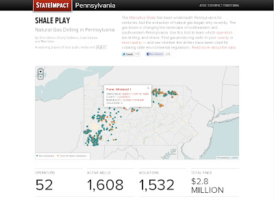
NPR’s map of natural gas drilling in the state of Pennsylvania.

NPR has created an interactive map of natural gas drilling in Pennsylvania. To find information about a specific site, click on one of the points on the map to view a pop up window with the name of the site, who operates the site, the location of the site, and the number of times the location has been cited for violations of environmental regulations. The page also displays additional information including total number of wells by county and by operator.

Clicking on a point on the map displays a pop up window with more information about the site.

Revisiting the Occupy Movement: Geographies of Protest

As the Occupy Movement spread across the United States this fall, we here at Outside the Neatline documented some of the geospatially-related web content that was created in response to the protests. Recently, I came across an excellent geographic examination of the protests in a two part post on the Regional Geogblog entitled Geographies of Protest and Occupation: From Manama, Bahrain to Richmond, Virginia. The blog is maintained by Professor Donald Rallis from the Geography Department at the University of Mary Washington (my Alma mater!). In Part 1, Professor Rallis discusses the significance of occupation of a place as a form of protest in addition to the events of the Arab Spring in Bahrain while in Part 2 he focuses specifically on the Occupy Movement in the United States.

For Outside the Neatline’s coverage of Occupy-related content, visit these posts: