Inside The White House – Bees! from The White House on Vimeo.
This beehive on the South Lawn is a first for the White House. The busy bees pollinate the kitchen garden, flora all over Washington and provide honey for the White House kitchen. Take a look at this year’s colony, estimated at about 70,000 bees, and listen to how the idea for a beehive on the South Lawn came about.
Category Archives: Uncategorized
More on Climate
I’d like to introduce the readers of Outside the Neatline to another blog that is really well done in regards to covering climate change/global warming and weather in general. The name of the blog is Dr. Jeff Masters’ Wunderblog and is hosted at the Weather Underground website. In his June 17, 2010 post, Dr. Jeff Masters reviews the most recent report from the National Climatic Data Center and features the figure below:
Additionaly, the Intergovernmental Panel on Climate Change (IPCC), Working Group II has announced the names of the 831 authors of the Fifth Assessment Report (AR5). This is a first of many steps towards the next large Assessment Report. In line with the announcement I’ve included some links to presentations given by some of the working groups as they prepare for AR5. The following presentations were given at the:
United Nations Climate Change Conference, COP 15 IPCC Side Event “IPCC Findings and Activities and their Relevance for the UNFCCC Process”Copenhagen, Denmark, 8th December 2009
– Mr Thomas Stocker Co-Chair of WG I
Impacts, Adaptation, and Vulnerability – Main Findings and New Features of the WG II Report
– Mr Chris Field Co-Chair of WG II
IPCC Special Report on Managing the Risks of Extreme Events and Disasters to Advance Climate Change Adaptation
– Mr Vicente Barros Co-Chair of WG II
Fifth Assessment Report (AR5)
– Mr Youba Sokona Co-Chair of WG III
IF you would like more information about climate change in the United States of America, check out the EPA’s Climate Change web page.
Geography in the News – Where am I?
So I came across this article in the NY Times today, albeit a little late (It was published over a year ago), and found it interesting. The article is a review of the book “You are Here” by Colin Ellard. The author examines our increasing dependence on GPS and associated mapping technology and whether it’s diminishing our ability to be spatially aware of where we are.
Examining spatial awareness is not a new concept. For other interesting titles on the topic see below:
You Are Here : Personal Geographies and Other Maps of the Imagination
Katharine Harmon
Did you Know? #28 – Obesity in America
I was watching a program on CNBC yesterday night entitled “One Nation Overweight“. The program highlighted a few of the problems associated with Obesity but some of the most startling facts were those concerning our nations children. Take this one for example; nearly one third of the our children are considered overweight and for the first time in the history of our nation some believe that our younger generation may have a shorter life span than their parents.
Here are some informative web links to better inform you on Americas weight problem:
- Center for Disease Control and Prevention
- Childhood Overweight and Obesity – CDC
- Office of the Surgeon General – Call to Action to Prevent and Decrease Overweight and Obesity
- Data for GIS Mapping – CDC’s Behavioral Risk Factor Surveillance System
For a quick overview of Obesity Trends in America with a spatial component, advance through the PowerPoint presentation created by the CDC below:
For photos and videos about Obesity around the world try National Geographic‘s Taboo show website here.
Did You Know #22 What a Walkshed is?
Avencia Atlas has created a walkshed analysis tool for New York City and Philadelphia that I think everyone should check out if they get a chance. The creators label it an App but I think it’s a really elegant example of a map mash-up!
The way it seems to work is that the user (you) set weights to individual services on a sliding scale ranging from -5 to +5. These services include grocery stores, coffee shops, bars, Wifi hotspots, transit and more. See the image below.

The result is continuous raster layer with various scores indicating if it’s in a walkable location (the walkshed). Another nice feature of the output is that you can download the .kml file for viewing in Google Earth.
 Avencia’s Decision Tree engine behind this neat map would allow for many different types of web based geographical analysis including sustainable development and environmental impact studies. Over all, Walkshed New York has an easy to use interface and polished aesthetic that is not seen in many mapping applications or map mash-ups! Special shout out to Brian Jacobs who designed the front end of this application. Go to his website at http://briantjacobs.com for more samples of his work.
Did You Know? #21 We’re On Facebook?
![]() That’s right! There’s another way to follow blog! Outside the Neatline now has it’s own group page on Facebook! Anyone can join our group and we encourage you to contribute. We also have a Discussions Tab that will allow you to grill us on just about any geography related questions you may have. It’s also a great place to give your suggestions or share neat stuff you find on the web!
That’s right! There’s another way to follow blog! Outside the Neatline now has it’s own group page on Facebook! Anyone can join our group and we encourage you to contribute. We also have a Discussions Tab that will allow you to grill us on just about any geography related questions you may have. It’s also a great place to give your suggestions or share neat stuff you find on the web!
In addition to following us on Facebook, you can also follow our blog with an RSS and a feed reader (Google has a nice one, follow this link). Just look for this icon at the top of our page:

This video should clear things up a bit too:
Want to see what Jeff is reading using his Google Reader RSS Aggregator? OK! Follow this link!
Did You Know? #14 Holy Bjerknes! El Nino in the News.
“The sky is falling! …err… I mean… Balloon Boy is coming!”
No, nothing as eventful as that… What I really meant to say is “El Nino is coming! “
Thankfully, there is no need to wonder if your life will be impacted. The National Oceanic and Atmospheric Administration(NOAA) has released their winter outlook report highlighting the effects of the latest El Nino-Southern Oscillation (ENSO) event. Not sure what ENSO is all about? The below animation shows what happens to ocean water temperatures and heights in the Pacific Ocean during an ENSO event. Following the animation is a link that will take you to a site that describes ENSO in more detail.
 Follow this link for a description about the events that take place during an El Nino.
If you’re living in New England, don’t blame the weather on ENSO! Check out the maps below created by NOAA to see which areas of the United States will be affected. Oh yeah, Want to know what that “Holy Bjerknes” business is all about? Click Here!
Did You Know? #13 European Union

Historical maps from a large selection of libraries in the European Union are now available to search and download from Europeana. Europeana links you (the world) to over 4.6 million digital items from collections that include the Rijksmuseum in Amsterdam, the British Library in London and the Louvre in Paris. Oh, and if maps are not your thing there’s art, text, audio and video there too!
Did you Know? #9 The changing geography of Connecticut through topographic maps.
People often have the misconception that geographers and cartographers are not relevant because “everything has been mapped”. But the landscape is always changing! Here are some examples of significant changes in the state over the past century.
Click on the images to enlarge them.
Ocean Beach, New London: Prior to 1938, the maps show homes along with two bridges in the area. However, the hurricane of 1938 destroyed most of the homes and one of the bridges. The Ocean Beach Area was changed to a park after the hurricane, as seen in 1958 topographic map. See photographs of what Ocean Beach looked like in 1923 and now.
Ocean Beach in 1938
Ocean Beach in 1958
Downtown Hartford: In the early 1950s, Downtown Hartford looked very different without interstate highways going through the city. Interstate 84 was built along the city’s major rail lines. After the construction of I-84, much of the Park River, found near the state capitol and Bushnell Park, was diverted into underground channels.
Downtown Hartford in 1952
Downtown Hartford in 1984
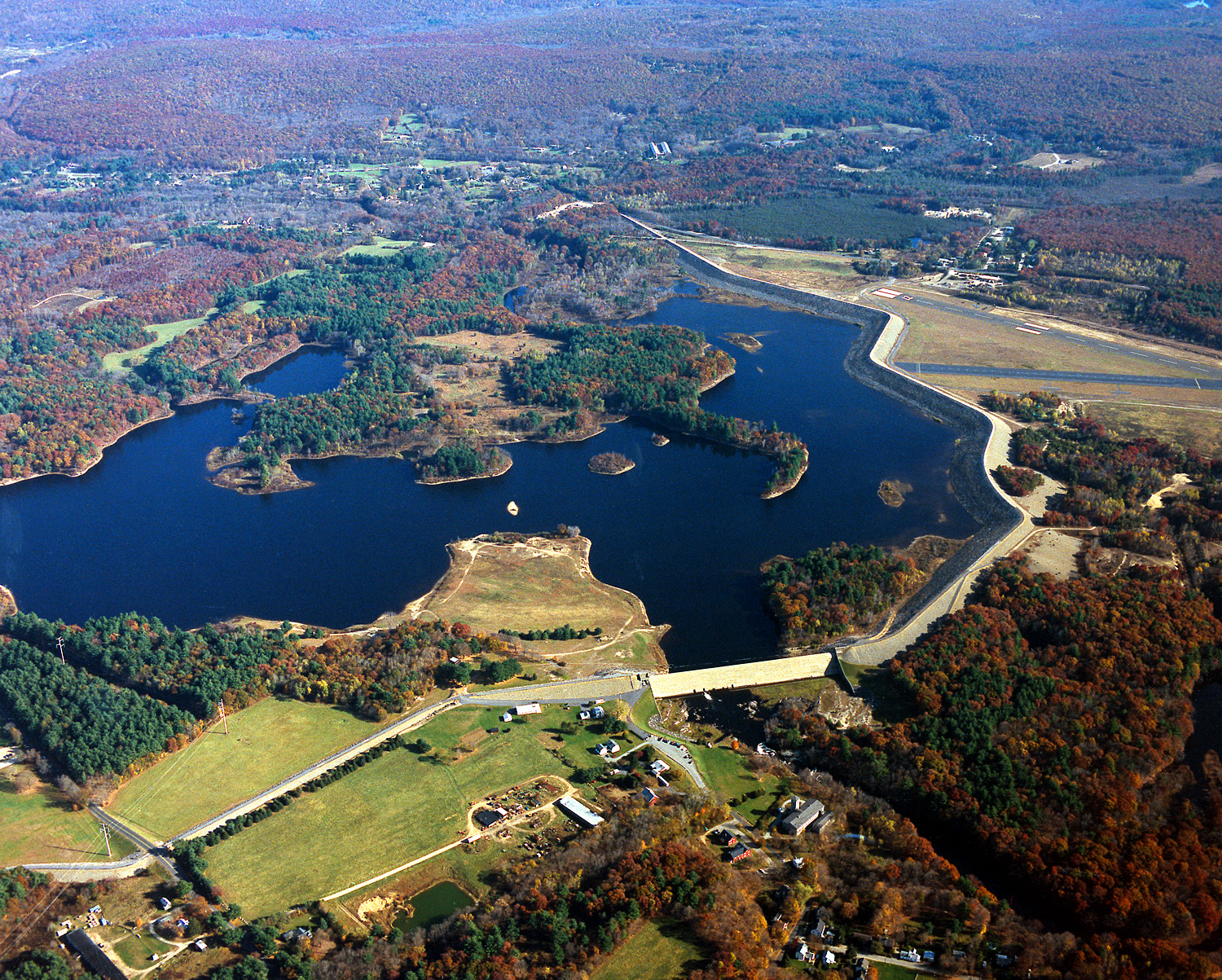
Mansfield Hollow, Mansfield: Mansfield Hollow Dam was built in 1952 by the Army Corps of Engineers to control flooding in the area. The large reservoir was created by damming the Natchaug River, which flooded a swampy area known as Turnip Meadow.
Mansfield Hollow in 1943
The Mansfield Hollow Area is shown below
Did you Know? #5 Monitoring Climate Change
The discussion about global warming and climate change has largely focused on the increasing amounts of carbon dioxide released in the atmosphere. But how do we know this? One of the major carbon dioxide monitoring stations is located in an unlikely place; near the top of a 14,000 foot volcano on Hawaii’s Big Island.
Mauna Loa Volcano, Hawaii
Mauna Loa Observatory is found on the Mauna Loa volcano at an elevation of about 11,000 feet. Why collect data about carbon dioxide levels on top of one of the largest volcanoes in the world? Mauna Loa’s remote location and high elevation ensures that carbon dioxide measurements are the most accurate possible since they are not greatly affected by major sources of air pollution in Asia, America, and Europe.
Carbon dioxide measurements were first taken by Charles Keeling in 1958. Since then, the amount of the gas in the atmosphere has steadily increased from 315 parts per million to 385 parts per million.
NOAA’s Mauna Loa Observatory
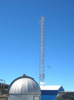
The tall tower takes carbon dioxide measurements at the observatory
Keeling’s graph of carbon dioxide levels, often called the Keeling Curve. The curve’s annual fluctuations are due to plants in the northern hemisphere absorbing carbon dioxide in the summer and then releasing it during the winter as deciduous trees lose their leaves.


