Health Insurance Enrollment Across New England for Age Group 18-24 between 2009-2015: What the U.S. Census Shows

The following visualizations showcase health insurance trends across New England since 2009 for people aged 18-24. The data is provided by the U.S. Census Bureau through the American Community Survey 1-Year Estimates for 2009 – 2015. 2009 is a great starting point for any analysis concerning health insurance trends given that the Affordable Care Act did not come into effect until after March 2010. For this post, I decided to explore insurance trends for the age group 18-24, due to one of the main aspects of the Affordable Care Act being that an individual can stay on their parents health insurance until age 26.

[xyz-ihs snippet=”Charles-1″]


[xyz-ihs snippet=”Charles-2″]


Some observations:

  1. Massachusetts seems to be in a category of its own with enrollment above 90% for every year between 2009-2015. It is worth considering the effects and legacy of the Massachusetts health care reform of 2006.
  2. Rhode Island had only 76.37% of its population aged 18-24 covered with health insurance in 2009. Enrollment would eventually increase by 15.35% between 2009 and 2015, all the way to 91.72% coverage.
  3. Rhode Island went from being the New England state with the lowest health insurance enrollment in 2009, to being the state with the third highest enrollment by 2015.
  4. Massachusetts and Vermont having the highest health insurance enrollments for age group 18-24 in New England interestingly corresponds with these states being considered the most ‘liberal’ states in the U.S. according to a Gallup poll. A quick comparison across the continental U.S. and Puerto Rico shows that this holds true for not just New England, but also for the entire nation as of 2015.
  5. Going on a similar direction as note #3, Maine and New Hampshire are the most conservative New England states according to the same Gallup poll, and they also happen to be the ones with the lowest health insurance enrollments for this particular age group inside New England.
  6. Vermont experienced a noteworthy increase in enrollment of 7.17% between 2010 and 2011.
  7. How did the 2007-2010 recession impacted Health Insurance enrollment for this particular age group? Although the states of Connecticut, Massachusetts, New Hampshire and Rhode Island experienced drops in health insurance enrollment just by looking at the percentages displayed in the visualizations, none of them had a drop of more than 2%; so effectively all drops in health insurance enrollment between 2009-2010 are covered by the margin of errors for the data corresponding to each state.
  8. Between 2009-2015, all of the New England States saw increases in health insurance enrollment for this particular age group.

Minor correction by the author: Observation #6 initially implied that Vermont’s increase in health insurance enrollment for age group 18-24 between 2010 and 2011 could be attributed to a decrease in the estimated population for said group between those two years. That was a data misread. Vermont actually experienced a population increase of 1.4% between 2010 and 2011 – not a decrease. Therefore, Vermont’s increase in enrollment is actually noteworthy.

Data Source:

Health Insurance Coverage Status by Sex by Age: U.S. Census Bureau, 2009-2015 American Community Survey 1-Year Estimates, Table B27001.

Trends in Occupations and Income, CT

The following visualization is a comparison of per capita income of different races of civilians within Connecticut and then taking a look at the occupations that lead to a drop or increase of capita of each race group. This information was obtained from the American Community Survey 2006-2015.

Descriptions of each occupational group:

Management- business and financial operations occupations, management occupations.

Computer Sci- computer and mathematics occupations, architecture and engineering, life physical and social science occupations.

Education- community and social service, legal occupations, education, training and library, arts, entertainment, sports and media.

Healthcare- health diagnostics, technologists, technicians, and health practitioners.

Service- healthcare support, protective service, food preparation and serving occupations. building and grounds maintenance, and personal care.

Sales- sales, office and administrative support.

Maintenance- farming, fishing, forestry, construction and extraction, installation, maintenance and repair.

Production- production, transportation, and material moving.

[xyz-ihs snippet=”Adam-1″]

Languages Spoken at Home in Connecticut 2011-2015

This visualization explores changes in the languages spoken at home in Connecticut counties over a five year period from 2011 to 2015.

In the last five years, much of Connecticut has seen a slow trend of decreasing English usage at home and an increase in other languages. Spanish is the most prevalent language spoken in Connecticut after English. Counties that are less populous have more limited lingual variation and have seen less growth in non-English language usage. Litchfield, Tolland, and Middlesex counties are the only counties where Spanish is not the most common non-English language spoken at home and is rivaled by the use of other Indo-European languages. These counties also have a very low percentage of people who speak a language other than English in comparison to the rest of the state. Most counties have seen a general increase in the use of Spanish at home, but other language groups have not displayed the same trends. Asian and Pacific Island languages showed a decrease from 2011 to 2013 and an increase from 2013 to 2015. Conversely, Indo-European languages saw increases from 2011 to 2013 and decreases from 2013 to 2015.

Windham county lacked language data for both 2011 and 2013 and had no data for 2015.

[xyz-ihs snippet=”Caroline-1″]

Diversity trends in undergraduate enrollments and faculty at research universities and colleges: 2001 to 2014

The following post and data visualization is by guest blogger Lisa Bernardo, highlighting her project for Prof. Harmon’s Economics Independent Study class.

This project aimed to analyze diversity of student enrollment versus faculty members at research universities in the United States.  Through our research and analysis, we wanted to determine whether the make up of the student population in terms of race and ethnicity was well represented within that of faculty members.  This was done by calculating race and ethnicity shares of undergraduate students and faculty members from the years 2001 through 2014 using data downloaded from the IPEDS Data Center.

From our analysis, it was concluded that the shares of black and Hispanic faculty members remained significantly below these shares for students consistently over the time period of 2001 to 2014.

We also found that shares of black and Hispanic students as well as faculty members did show significant increases from 2002 to 2014, though the faculty increase lagged the student increase.  The black and Hispanic enrollment share for undergraduate students increased from 4.04 percentage points from 14.87% in 2002 to 18.91% in 2014.  Whereas, this same share for faculty members only increased 3.16 percentage points from 12.65% in 2002 to 15.81% in 2014.

[xyz-ihs snippet=”Diversity-trends-in-undergrad-enrollment”]

Estimated population change for selected age groups in U.S. counties, 2010-2015

This visualization draws on another dataset made available through the U.S. Census Bureau’s American FactFinder data engine, Annual Estimates of the Resident Population for Selected Age Groups by Sex for the United States, States, Counties, and Puerto Rico Commonwealth and Municipos: April 1, 2010 to July 1, 2015.T The Census Bureau’s Population Division releases yearly data  population estimates by age, race, and ethnicity which update the most recent decennial census counts with the latest birth, death, and international and domestic migration data. The estimates’ methodology incorporates a variety of data sources including IRS, Medicare, and American Community Survey datasets, as well as National Center for Health Statistics birth and death data.

[xyz-ihs snippet=”County-population-change-2010-2015″]

Last month the Census Bureau’s Population Estimate Program released the latest estimates for states, counties, and county subdivisions, including total estimated population for Connecticut towns as of July , 2015.

Since the 2010 Census, it is estimated that 61 towns gained population, while 108 lost population; Fairfield County gained about 3.4%, while towns in Litchfield County together lost an estimated 3.3% of their population since 2010.

[xyz-ihs snippet=”CT-town-population-estimates-2010-2015″]


State lottery system revenue and expenditures, 2014

This dashboard highlights another table available through the U.S. Census Bureau’s American FactFinder data portal:  Income and Apportionment of State-Administered Lottery Funds: 2014 from the 2014 State Government Finances data program.

The data – which includes total revenues of lottery systems, expenditures in lottery system administration and prizes, and total lottery revenue made available to fund state government – show a wide range of both public participation and approaches to state lottery administration among the 43 state lottery systems.

Compared with figures from the 2014 American Community Survey, Massachusetts had the highest lottery revenues from its adult population on a per-capita basis – about $900 of revenue for each adult 18 and over. Massachusetts also had the highest rate of payout to winners – returning  72% of gross lottery revenues in the form of prizes.  25.6% of Massachusetts state lottery revenues were made available to the state, compared with the national average of 34.6% – yet the state still ranked 4th in total lottery proceeds made available to finance other state functions – yielding more than $1.2 billion to the state in 2014.

Arkansas had the lowest percentage of lottery revenues returned to state government – 20.4% – and was the 12th most costly state system to run in terms of lottery administrative costs as a percentage of gross lottery revenue. West Virginia lottery system allocated the smallest percentage of gross lottery revenue on prizes – 17.1% – and returned the highest percentage of lottery  revenue back to the state – 77.8% –  to be made available for other government functions.


[xyz-ihs snippet=”State-lottery-funds-2014″]

Mapping Connecticut School District Data in Tableau

This is the third in a series of posts on using Tableau Desktop or Tableau Desktop Public Edition to map Connecticut data using custom polygons, to accommodate geographic entities not recognized innately in the Tableau mapping functionality. See these other posts for more information on creating filled maps for Connecticut towns and Census Tracts in Tableau:

Tableau and Tableau Public offer robust mapping capabilities, including the ability to recognize geographic entities in your data and instantly create choropleth (filled) maps with shapes for counties, states, and countries. For users that want to create filled maps for geographic entities not recognized innately by the software, Tableau supports the creation of polygon-shaded maps, allowing users to map data onto polygon shapes which correspond to sales regions, marketing areas, etc. The Connecticut State Data Center has created a number of custom polygon map files corresponding to Connecticut geographies not innately supported in Tableau, including Connecticut school districts:

CT_School_District_Polygons_for_Tableau

The directions below show you how to connect to this file to create a custom polygon map for school districts, and then join the Polygon data with some sample demographic data from the American Community Survey to create a filled/choropleth map. This is followed by additional tips to joining the polygon shapes with additional data sources, such as data from Connecticut Open Data, CTDataCollaborative, and Connecticut Department of Education.

Step 1: Setting up the School District polygon map:

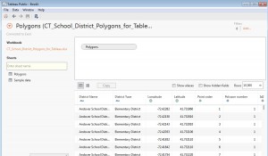
  1. Save a copy of the CT_School_District_Polygons_for_Tableau Excel workbook (linked above) to your computer. Open Tableau Public or Desktop, and from the Data menu navigate to the Excel workbook, and drag the Polygons sheet into the data space. Click Go to Worksheet or open a new New Sheet on the task bar.connecting
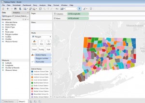
  2. Under Measures in the Data pane, drag Longitude to the Columns shelf. Note that the Aggregation for this pill should be average; i.e. the pill should say AVG(Longitude). Aggregations can be changed if necessary (e.g. from Sum to Average) from the carrot menu for the measure in the rows or columns shelf.
  3. Drag Latitude to the Rows shelf. The aggregation should also be average (AVG) in the pill.
  4. In the Marks card, change the view type menu from Automatic to Polygon
  5. If Pointorder was placed in the Measures pane, it must be converted to a Dimension – simply drag it from Measures to Dimensions. Then, drag Pointorder to Path on the Marks card.
  6. Drag Polygon Number onto Detail on the Marks card.
  7. Drag District Name from Dimensions onto Color on the Marks card. (If a dialog window appears, confirm that you want to Add all members).
  8. To see the boundaries of districts more clearly, it is helpful to display borders around the polygons. To do this, click Color on the Marks card, and from the Border carrot menu, select a color. You should now see a map like this:map
  9. At this point, it’s important to note that mapping Connecticut school district data is a little tricky, because the varying administrative structures among districts creates overlapping geographies that makes it impossible to show all districts on a single map. There are three basic administration models for school districts in Connecticut, and geographically speaking, they aren’t mutually exclusive – as many towns send children to more than one district. Here are the three types (the names of the district types are from the Census Bureau (which publishes the shape files from which the polygons are derived); and may not correspond to local or state terminology):

Continue reading

Mapping Connecticut Census Tract data in Tableau

This is the second in a series of posts on using Tableau Desktop or Tableau Desktop Public Edition to map Connecticut data using custom polygons, to accommodate geographic entities not recognized innately in the Tableau mapping functionality. See these other posts for more information on creating filled maps for Connecticut towns and school districts in Tableau:

The U.S. Census Bureau aggregates and publishes Decennial Census and American Community Survey data at geographic levels large and small, including Census Tracts – small statistical subdivisions of roughly 1200-8000 people. Connecticut has 833 Census tracts; many small towns comprise a single Census Tract, while Hartford has more than 30. There are more than 7,500 data tables available through American FactiFinder for Connecticut Census tracts on demographic and economic measures including income and poverty, educational attainment, health insurance coverage, housing characteristics, and more. The steps below will let you create a choropleth map in Tableau for any Census Tract-level data downloaded from American FactFinder, enhancing the functionality of Tableau to analyze and visualize ACS and Decennial Census data.

Tableau support documentation includes instructions on converting ArcGIS shape files into spreadsheet files that Tableau can use to construct custom polygon maps. The Connecticut State Data Center has converted a number of U.S. Census Bureau TIGER/Line shape files into polygon data files for use in Tableau, including polygon  files for Connecticut towns, school districts, Census tracts, and legislative district boundaries. If you would like to visualize Connecticut Census Tract-level data on a map (as in this dashboard) in Tableau, this Excel workbook:

CT_Census_Tract_Polygons_for_Tableau.xlsx

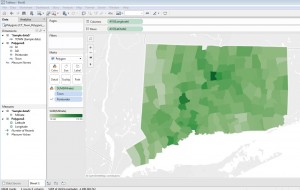
of Connecticut Census Tract polygons contains a Polygon spreadsheet that will render a map of all Census tracts within Connecticut, and an additional sheet of housing value data from the American Community Survey that you can link with the polygon map, following the steps below, to create a choropleth map like the one below (click image to see full size). Additional information will help you download more tract-level data from American FactFinder, and join and map it with the Polygon data.

8

Each of the 29,202 rows of the Excel Polygon sheet describes a single point on the outline of a single tract’s boundaries, with a field for longitude and latitude of the point. Another field for each row is Point Order, which tells Tableau in which order to ‘connect the dots’ to form each tract on the map. For example, Mansfield’s shape has 208 points in the data set. Tableau draws each polygon by starting with the latitude and longitude of point 1, then continues drawing the shape until it gets to point 208, completing the outline of the town. The software does this for all 29,000+ points on the map instantly, whether in Tableau Desktop or Public, and map tools seem to work as quickly with a polygon map published to Tableau Public as any boundaries innately recognized in Tableau.

Step 1: Setting up the polygon map:

Continue reading