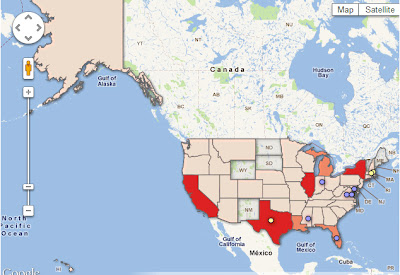
A new map from Mother Jones (pictured above) depicts 825 known crime exonerations in the United States since 1989. Clicking a state on the map allows you to find out specific information including the number of exonerations during this time period in the respective state as well as whether or not the exonerations were based on DNA evidence. For example, in Connecticut, the map indicates there have been 7 verified exonerations since 1989, 4 of which came via DNA evidence and 3 of them via non-DNA evidence. In addition, the map label indicates that Connecticut has a Compensation Law. The map also indicates the states where posthumous exonerations have occurred. Visit the Mother Jones article for more.
Category Archives: Uncategorized
TypeBrewer – Visualize Typography Before Committing
Visualize your typography for your cartographic representation before you begin and save yourself time!
 |
| TypeBrewer.org |
TypeBrewer.org presents an interactive mapping interface that allows a user to play with font types, character spacing, and density of labels before even beginning their map in their chosen software. After selecting the style that suits the author of the map, you can download a template for graphic design software or create a style specification sheet to use as a reference in a GIS platform.
If you crave more information about cartographic representation check out Semiology of Graphics by Jacques Bertin, available from ESRI Press.
Occupy Our Homes Day of Action
Occupy Our Homes has designated today, December 6, as a day of action to “stop and reverse foreclosures”. The Occupy Our Homes website features stories of protests as well as personal narratives and a blog. Mother Jones has created a map of the cities with planned foreclosure protests, which can be seen above.
Esri Adds Community Analyst to Educational Site License Program
Students Provided with Easy-to-Use Tools to Better Understand Local Issues
A short post, follow the link above for the full press release from ESRI. This is exciting news for educators who would like to expose their students to exploratory spatial data analysis. Click here for a short video clip!
Census Bureau Releases 2010 Income and Poverty Estimates for All Counties and School Districts

Between 2007 and 2010, the poverty rate for school-age children showed a statistically significant increase in about 20 percent of counties across the United States, according to U.S. Census Bureau estimates for income and poverty in 2010 for every county and school district.
In all, 653 counties saw a significant increase in poverty for children ages 5 to 17 in families and eight counties saw a significant decrease over the period. A similar analysis of median household income showed 735 counties with a significant decrease over the 2007 to 2010 period and 78 counties with a significant increase.
The 2010 Small Area Income and Poverty Estimates (SAIPE) data are available for 3,142 counties and nearly 14,000 Title I-eligible school districts. The data represent the only current, single-year income and poverty estimates available for all sizes of counties and school districts. These estimates are released annually; however, 2007 was chosen for comparison because it was a pre-recessionary year.
The 2010 estimates also show that about one-third (1,011) of counties had school-age poverty rates significantly above the national poverty rate of 19.8 percent and 851 counties had rates significantly below. Among the 1,306 counties with total population less than 20,000, 73 counties were significantly above 30 percent poverty for school-age children in 2010. There were 48 counties above 30 percent in 2007.
“SAIPE also provides county and state estimates for the total number of people in poverty, the number of children under 5 in poverty (for states only), the number of children 5 to 17 in families in poverty, the number of children under 18 in poverty and median household income. School district estimates from SAIPE, produced for the Department of Education to implement provisions of the No Child Left Behind Act of 2001, are available for the total population, the number of children 5 to 17 and the number of children 5 to 17 in families in poverty.
“This release includes publication of the 2010 SAIPE Highlights Document, which presents SAIPE statistical trends and explains the sources and approach. Also available is an interactive mapping tool (http://www.census.gov/did/www/saipe/data/maps/index.html), allowing access to the county and school district statistics by selecting the geographic area for display, as well as thematic maps for all concepts available from SAIPE 2010 and 2009. More information can be obtained from the SAIPE main page.
SAIPE combines the latest American Community Survey data with aggregate data from federal tax information, administrative records on Supplemental Nutrition Assistance Program participation, 2000 and 2010 Census statistics and annual population estimates.
These statistics, sponsored by the U.S. Department of Education, are used as one of the criteria to allocate federal funds to local educational agencies. In addition, state and local programs use these statistics for distributing funds and managing school programs.
Modeling the Elevation of Martha’s Vineyard in ArcGIS
This year, my graduate research in the UConn Department of Geography has focused on the vulnerability of Martha’s Vineyard to climate-related hazards like sea level rise and hurricanes. Using ArcGIS’ 3D Analyst, I have created a triangulated irregular network (TIN) to visualize elevation, which you can see above. I generated this model from contour lines (3 meter intervals), which I downloaded from MassGIS. Those of you familiar with the island will notice that this data, from 2005, does not show the breach of Norton Point Beach, which occurred most recently in 2007. For climate related happenings in the Cape Cod and Islands region, check out Climatide- a blog from the Cape and Islands NPR station (WCAI) and authored by Dr. Heather Goldstone.
Special Tabulation Based on Supplemental Poverty Measure Update
In a follow-up to the release of the supplemental poverty measure report, the New York Times commissioned the Census Bureau to create a special tabulation based on the measure, and as a service to other users we are posting this tabulation online. The statistics focus on the characteristics of the population just above the poverty line (100 to 150 percent of the poverty threshold). The supplemental poverty measure does not replace the official poverty measure but is intended to better reflect contemporary social and economic realities and government policy effects and thus provide a further understanding of economic conditions and trends. Internet address:
http://www.census.gov/hhes/povmeas/methodology/supplemental/research.html.
Special supplemental poverty measure tabulation:
http://www.census.gov/newsroom/releases/pdf/CB11-TPS.51SpecTab.pdf [PDF]
Supplemental poverty measure report:
http://www.census.gov/newsroom/releases/archives/news_conferences/2011-11-04_spm_webinar.html.
Official poverty measure:
http://www.census.gov/newsroom/releases/archives/income_wealth/cb11-157.html.
Mercury Hotspots
 |
| In the U.S., Mercury, which is toxic to brain development, is commonly emitted into the atmosphere. |
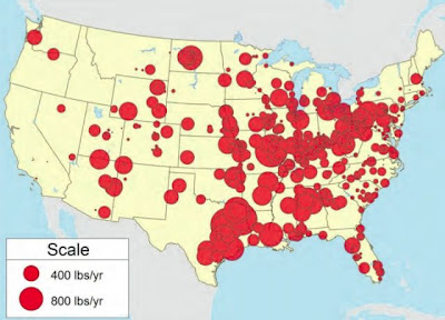
Do you live near a Mercury Hotspot? I originally saw this map, which is based on a recent report from Environmental America, on Mother Jones. Although Mercury is toxic to us (it negatively affects brain development), it is commonly emitted into the air by industry. In the United States, 2/3 of the emissions are from coal fired power plants alone.
For more on locating pollution in the U.S., check out our other posts:
NPR and the Center for Public Integrity Investigate Poisoned Places of the U.S.
Are Toxic Chemicals Being Released Near You?
Tweeting Around the World
 |
| A screenshot of languages used on Twitter in the Americas. |
Since its inception, social media has spread rapidly. One of the most globalized products is Twitter, which allows users to send out short messages to followers. It is estimated that users send out approximately 200 million of these messages a day. Being such a globalized product, the languages spoken by users includes much more than just English, as you can see in the map screenshots below (the full map is available on Flickr).
 |
| A screenshot languages used on Twitter in Europe and Asia. |
 |
| The Legend for the map. |
First Time Mothers: Maternity Leave & Employment Patterns
 |
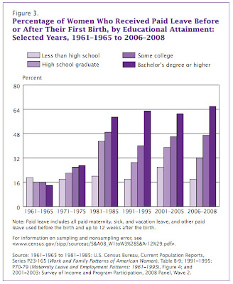
| A pattern of the past few decades: women are more likely to work before and after the birth of their first child than they were in the past. |
| A new U.S. Census Bureau report shows that women with higher educational attainment are more likely to work preceding the birth of their first child. |
 |
| The U.S. Census Bureau’s report also indicates women with higher educational attainment are more likely to receive paid leave before or after their first birth. |


