Connecticut Census Tract Data Browser for American Community Survey Data

Census Tracts, statistical areas of roughly three to seven thousand individuals, are the smallest practical geography for analysis using American Community Survey estimate data. In Connecticut many smaller towns have a single Census Tract, while larger cities can have more than a dozen.The Census Bureau’s American FactFinder data tool provides more than 3,500 different tables of data from the American Community Survey for Census Tracts on a wide range of topics. While the organization, documentation, downloading capabilities of American FactFinder are extremely sophisticated, it can be difficult to identify and select particular Census Tract for analysis – say, those in the northern portion of Hartford – without already being familiar with the boundaries of the tracts. (While this can be done using the Reference Map interface in American FactFinder, it is a fairly cumbersome process).

The shaded map of Census Tracts below allows the user to select single or multiple tracts for analysis, and takes advantage of the deep linking capabilities of American FactFinder.  By holding down the Control key, multiple tracts can be selected with the mouse. The links to demographic, economic, and other data which then appear in the mouseover ‘Tooltip’ menu can be a starting point for exploring additional data for the selected tracts, because the geographies chosen remain selected in the resulting American FactFinder session. Upon following the link in the Tooltip to a table in American FactFinder, click the Advanced Search tab above the table to return to the American FactFinder search screen, to browse among the thousands of tables of data for the tract(s), using a keyword search or the Topics menu.

[xyz-ihs snippet=”Census-Tract-Data-Browser”]

Gini Index of Income Inequality for U.S. Counties

This visualization displays U.S. Census Bureau American Community Survey Gini index estimates for U.S. counties.  The Census Bureau defines the Gini index as “a statistical measure of income inequality ranging from 0 to 1. A measure of 1 indicates perfect inequality, i.e., one household having all the income and rest having none. A measure of 0 indicates perfect equality, i.e., all households having an equal share of income.” For an analysis of the ACS Gini index data, see the Census Brief: Houshold Income Inequality Within U.S. Counties.

The visualization allows the viewer to filter the counties displayed on the map by Gini index. Links into American FactFinder from the mouseover Tooltip for each county on the map provide further economic data including median household income, poverty, and insurance coverage data for the county.

[tableau server=”public.tableausoftware.com” workbook=”GINIIndexinU_S_Counties” view=”Dashboard1″ tabs=”no” toolbar=”no” revert=”” refresh=”yes” linktarget=”” width=”950px” height=”900px”][/tableau]


Educational Attainment, and Earnings by Educational Attainment & Gender, in Connecticut Towns

The map and graphs below provide information on levels of educational attainment among Connecticut towns, along with data on median earnings by town for men and women having various levels of education. The data on education and income are tabulated only for those age 25 and over. The American Community Survey defines educational attainment as “the highest level of education completed in terms of the highest degree or the highest level of schooling completed.”

The data below are taken from Table S1501 the 2008-12 5-Year Estimates data release of the American Community Survey. The complete data for the state and all towns can be downloaded here.

For help with locating data on Connecticut from the American Community Survey or other Census Bureau program, please contact the Connecticut State Data Center.

[tableau server=”public.tableausoftware.com” workbook=”EducationandEarningsbyTown2012ACS5yr” view=”Dashboard1″ tabs=”no” toolbar=”no” revert=”” refresh=”yes” linktarget=”” width=”800px” height=”900px”][/tableau]

Educational Attainment for the Population Below the Poverty Level in Connecticut Towns (American Community Survey 2008-12 5-Year Estimates data)

The recently-released ACS 2008-12 5-Year Estimates data provide updated estimates for all Connecticut towns, including detailed data on the population living below the poverty level. The visualization below uses data provided by the ACS on the educational attainment of those age 25 and older in poverty, providing details on the percentage of this population which has less than a high school diploma or GED, a high school degree or equivalent, some college credits or an associate degree, or a bachelor’s degree or higher. The map focuses on the percent of those in poverty in each town who hold a bachelor’s degree or higher. By selecting any town on the map, the bar graphs beneath will display more detailed educational attainment data for the town, both for the general population and those below the poverty threshold.

The American Community Survey uses poverty thresholds established by the Office of Management and Budget; more information is available here. It’s important to note that these thresholds do not vary geographically; for example, the same poverty threshold for a household consisting of a single adult with a related child under 18 ($15,504) is used in every state.

[tableau server=”public.tableausoftware.com” workbook=”EducationandPoverty_0″ view=”Dashboard1″ tabs=”no” toolbar=”no” revert=”” refresh=”yes” linktarget=”” width=”800px” height=”800px”][/tableau]

May 2013 is “Older Americans Month”

Older Americans Month: May 2013

A meeting with the National Council of Senior Citizens resulted in President John F. Kennedy designating May 1963 as Senior Citizens Month, encouraging the nation to pay tribute to older people across the country. In 1980, President Jimmy Carter’s proclamation changed the name to Older Americans Month, a time to celebrate those 65 and older through ceremonies, events and public recognition.

OlderAmericansViz

(Click on visualization to interact with data)

Connecticut has 499,474 individuals who are 65 and older, comprising 14% of the state’s total population.

OlderAmericansCT

41.4 million

The number of people who were 65 and older in the United States on July 1, 2011, up from 40.3 million on April 1, 2010 (Census Day). In 2011, this group accounted for 13.3 percent of the total population.
Source: Population estimates <http://www.census.gov/popest/data/national/asrh/2011/index.html>

92.0 million

Projected population of people 65 and older in 2060. People in this age group would comprise just over one in five U.S. residents at that time. Of this number, 18.2 million would be 85 or older.
Source: Population projections <http://www.census.gov/population/projections/data/national/2012.html>

2.4 million

Projected number of baby boomers in 2060. At that time, the youngest baby boomers would be 96 years old.
Source: Population projections <http://www.census.gov/population/projections/data/national/2012.html>

2056

The year in which, for the first time, the population 65 and older would outnumber people younger than 18 in the U.S.
Source: Population projections <http://www.census.gov/population/projections/data/national/2012.html>

Nearly 17%

Projected percentage of the global population that would be 65 and older in 2050, up from 8 percent today. In 2005, Europe became the first major world region where the population 65 and older outnumbered those younger than 15. By 2050, it would be joined by Northern America (which includes Canada and the United States), Asia, Latin America and the Caribbean and Oceania (which includes Australia and New Zealand).
Source: International Data Base <http://www.census.gov/population/international/data/idb/informationGateway.php>

Income and Wealth

$33,118

The 2011 median income of households with householders 65 and older, not significantly different from the previous year.
Source: Income, Poverty, and Health Insurance Coverage in the United States: 2011
<http://www.census.gov/prod/2012pubs/p60-243.pdf>

8.7%

The percent of people 65 and older who were in poverty in 2011, statistically unchanged from 2010. There were 3.6 million seniors in poverty in 2011.
Source: Income, Poverty, and Health Insurance Coverage in the United States: 2011
<http://www.census.gov/prod/2012pubs/p60-243.pdf>

$170,128

Median net worth for householders 65 and older in 2010, down from $195,890 in 2005.
Source: Net Worth and Asset Ownership <http://www.census.gov/people/wealth/>

Serving Our Nation

9.2 million

Estimated number of people 65 and older who were veterans of the armed forces in 2011.
Source: 2011 American Community Survey <http://factfinder2.census.gov/bkmk/table/1.0/en/ACS/11_1YR/B21001>

Jobs

16.1%

The percentage of people 65 and older who were in the labor force in 2010, up from 12.1 percent in 1990. These older workers numbered 6.5 million in 2010, up from 3.8 million in 1990. By 2011, this rate had increased to 16.2 percent.
Source: Labor Force Participation and Work Status of People 65 and Older <http://www.census.gov/prod/2013pubs/acsbr11-09.pdf>

22.3%

The percentage of people 65 and older in Alaska in the labor force in 2011. Labor force participation rates for people 65 years and over ranged from 22.3 percent in Alaska to 12.5 percent in West Virginia.
Source: Labor Force Participation and Work Status of People 65 and Older <http://www.census.gov/prod/2013pubs/acsbr11-09.pdf>

44.3%

Among those 65 and older who worked in 2011, the percentage who worked full-time, year-round. Among states and equivalents, the District of Columbia had the highest rate, at 62.2 percent.
Source: Labor Force Participation and Work Status of People 65 and Older <http://www.census.gov/prod/2013pubs/acsbr11-09.pdf>

Education

81.1%

Proportion of people 65 and older in 2012 who had completed high school or higher education.
Source: Educational Attainment in the United States: 2012
<http://www.census.gov/hhes/socdemo/education/data/cps/2012/tables.html>

24.3%

Percentage of the population 65 and older in 2012 who had earned a bachelor’s degree or higher.
Source: Educational Attainment in the United States: 2012
<http://www.census.gov/hhes/socdemo/education/data/cps/2012/tables.html>

Marital Status and Living Arrangements

58%

Percentage of people 65 and older who were married in 2012.
Source: Families and Living Arrangements <http://www.census.gov/hhes/families/data/cps2012.html>

26%

Percentage of people 65 and older in 2012 who were widowed.
Source: Families and Living Arrangements <http://www.census.gov/hhes/families/data/cps2012.html>

Voting

70.3%

Percentage of citizens 65 and older reporting casting a ballot in the 2008 presidential election. Not statistically different from those 45 to 64 (69.2 percent), people 65 and older had the highest turnout rate of any age group.
Source: Voting and Registration in the Election of November 2008 (Table 2) <http://www.census.gov/prod/2010pubs/p20-562.pdf>

Homeownership

80.7%

Percentage of householders 65 and older who owned their homes as of fourth quarter 2012.
Source: Current Population Survey/Housing Vacancy Survey <http://www.census.gov/housing/hvs/>

Centenarians

53,364

The number of people 100 years old and older counted by the 2010 Census.
Source: Centenarians: 2010 <http://www.census.gov/prod/cen2010/reports/c2010sr-03.pdf>

20.7

For every 100 centenarian women, the number of centenarian men in 2010.
Source: Centenarians: 2010 <http://www.census.gov/prod/cen2010/reports/c2010sr-03.pdf>

43.5%

In 2010, percentage of centenarian men who lived with others in a household, the most common living arrangement for this group. For their female counterparts, the most common living arrangement was residing in a nursing home (35.2 percent).
Source: Centenarians: 2010 <http://www.census.gov/prod/cen2010/reports/c2010sr-03.pdf>

3.29

Number of centenarians per 10,000 people in North Dakota in 2010. North Dakota was the only state with more than three centenarians per 10,000 people.
Source: Centenarians: 2010 <http://www.census.gov/prod/cen2010/reports/c2010sr-03.pdf>

States and Counties

17.6%

Percentage of Florida’s population 65 and older in 2011 — which led all states.
Source: Population estimates <http://www.census.gov/popest/data/national/asrh/2011/index.html>

45.5%

Percentage of the population of Sumter County, Fla., that was 65 or older in 2011, which led all of the nation’s counties.
Source: Population estimates <http://www.census.gov/popest/data/national/asrh/2011/index.html>

The foreign born population in the US and Connecticut

According to the Census Bureau, America’s foreign born population has undergone dramatic changes in size, origins and geographic distribution within the past 50 years.  This infographic created by the Census Bureau depicts some of the major trends and statistics. As just one example: in 1960, 75% of foreign born individuals in the US were from Europe; but in 2010 only 12% were from Europe, while 53% were from Latin America and 28% were from Asia.

Here’s a snippet:

Foreignborn

So, who is emigrating from Asia to the United States? In 1960 only 0.5 million people immigrated to the US from Asia, but by 2000 it had risen to 8.2 million, and in 2011 that number had reached 11.6 million, according to the ACS report linked to above.

Here in Connecticut, the 2007-2011 ACS data from American FactFinder shows that the total population was 3,558,172 with foreign-born individuals (both citizens and non-citizens) numbering 474,139 (+/- 5,979); thus comprising between 13.2% and 13.5% of the total population. By comparison, in 1960 the US Census reported that the total population of Connecticut was 2,535,234 and that 38.7% of that total (982,143) was foreign born with a majority (237,146) of individuals from Italy. The following visualization shows countries where foreign-born individuals emigrated from in 1960 that had numbers of emigrants higher than 20,000 individuals. Click the visualization to interact more with the data.

The other countries or areas that the Census recorded individuals emigrating from include: Norway, Denmark, Netherlands, Switzerland, France, Finland, Yugoslavia, Romania, Greece, Portugal, Asia and Mexico. There were also categories for Other and Unknown. Both Asia and Mexico now comprise higher emigration rates; but in 1960, only 645 people from Mexico came to Connecticut, and 11,786 came from Asia. The ACS 2007-2011 estimates for foreign born place of birth show that by 2011 there were 105,365 emigrants from Asia and 25,743 from Mexico. The emigration pattern has certainly changed in Connecticut since the 1960s, see below visualization for the countries in 2011 from which more than 20,000 people emigrated (including those with a MOE that causes the estimate to exceed 20,000); and unlike the 1960s, there are very few countries from which 20,000 or more people emigrated.The one country with the single highest number of foreign-born individuals in CT was Jamaica, with 34,742 individuals. In terms of regions broken down by continent, the highest number of individuals collectively came from Latin America which includes the Caribbean, Central and South America (197,224).
2011_fbp


Visualizing the pay gap: educational attainment & income data from the American Community Survey

Each year the Census Bureau’s American Community Survey provides dozens of tables of interesting data related to education – tracking enrollment in public and private schools, the number of individuals holding bachelor’s degrees in various fields, and cross-tabulating educational levels with characteristics as diverse as place of birth, mobility and race. Data on the relationship between educational attainment and income are available in table S1501 of the ACS. Based on the data in that table, the thematic map and chart below illustrate the relationship between education and income, as well as the gap in income between men and women with equivalent levels of educational attainment – from those with less than a high school diploma to those with a graduate or professional degree.

<a href=”undefined”><img alt=”Dashboard 1 ” src=”http://public.tableausoftware.com/static/images/Ea/EarningsbyEducationalAttainment2010/Dashboard1/1_rss.png” style=”border: none” /></a>

Hurricane Visualizations – 1851 to Present

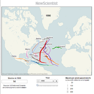
With hurricane season upon us, the New Scientist has developed a visualization of the path of hurricanes for the past 20 years. Explore year by year the path of each hurricane, view the total number of storms for each year, and each visualization includes the maximum wind speed for each storm.

As you explore this article further you will discover that 2005, the same year that Katrina and Rita caused so much damage to the gulf coast, there were a total of 28 storms. These 28 storms in 2005  resulted in just over 1,000 casualties, representing the highest number of hurricane related deaths over this 20 year period.

Review this article and view 1990-2010 Hurricane Visualizations at:
http://www.newscientist.com/blogs/shortsharpscience/2011/05/prepare-for-hurricane-season.html

Want To Explore More Hurricane Data?
The National Oceanic and Atmospheric Administration (NOAA) has developed an interactive interface to enable users to explore Historical Hurricane Tracks which can be explore by location, storm name, and ocean basin. This interface allows users to view storms from the late 1800s to present and includes barometric pressure readings, wind speeds, storm category, and more details plus the ability to download the data. This visualization can be viewed at: http://csc.noaa.gov/hurricanes/

The NOAA Historical Hurricane Tracks also allows users to refine their search by storm category, time frame, and even barometric pressure. This interface provides great visualizations of the life cycle of a hurricane and provides an interactive display of the path of the hurricane.

More Resources to Explore
Want to explore more details about hurricanes and historical hurricane visualizations? The following links include some additional resources related to hurricanes:

The MetroMonitor


The Brookings Institution’s MetroMonitor is a great resource for economic performance at the scale of the metropolitan area. It contains data that tracks economic performance from 1993 to the end of 2011 spanning the entire globe (click here to read a summary of economic change from 2010-2011). The data is organized into the following categories: Overall Rankings, Income Growth, Employment Growth, and Industrial Structure. In addition to an interactive map (see screenshot below), the MetroMonitor also contains summary reports for each respective metro area that shows a breakdown of the aforementioned categories (for example, click here to see the report for Hartford, CT).

For an explanation of the importance of the scale of the metropolitan area in the global economy, watch the video above. The video explains three major findings regarding Brookings’ research regarding metro areas and the global economy: 1. The global economy is led by metro areas, 2. The Great Recession accelerated a shift in the metro map, and 3. The macro and metro scale are important for economic growth. Also, check out this article by Alan Berube, Senior Fellow and Research Director at Brookings. Berube discusses why local economic growth is important given recent global events, like the Great Recession and Arab Spring, and how local economic growth can be the catalyst for a sustained economic recovery. For more regarding economic recovery, visit our earlier post regarding the MetroMonitor.

Historical Secessionist Movements in the United States

The United States has seen many secessionist movements throughout its history. Of course the most famous is the Confederate States of America, which seceded and triggered The Civil War, but, did you know that Dukes County, Massachusetts (much of which is made up of the communities on Martha’s Vineyard) threatened to secede from Massachusetts in 1977? Or, that 5 of 6 counties in southern New Jersey approved a non-binding secession proposal in 1980? Urban Mapping has an interactive map of secessionist movements throughout the history of the United States, which includes historical information on the movements in addition to socioeconomic indicators of the geography associated with each respective movement. Information on the movements comes from Wikipedia and the Lost States Blog. The socioeconomic indicators apparently come from aggregating county data for geographies in the U.S. while The World Bank is cited for international data.