|
|
|
CT Data.org Webinars – July 2012
Reply
 Outside the Neatline

|
|
|
The world’s inhabitants in 2012 are an older mix of people than was the case a decade ago, driven by declining fertility and increasing life expectancy. According to new U.S. Census Bureau population projections, by midcentury most world regions will resemble Europe, which in 2005 became the first major world region where the population 65 and older outnumbered those younger than 15 (see Figure 1).
 |
| Figure 1: Europe Population Pyramid: 2005 |
Northern America, which includes Canada and the United States, will have joined Europe in this historic reversal of age group sizes by 2050 (see Figure 2), as will Asia (Figure 3), Latin America (see Figure 4) and Oceania (which includes Australia and New Zealand) (see Figure 5).
 |
| Figure 2: Northern America Population Pyramid 2050 |
 |
| Figure 3: Asia Population Pyramid 2050 |
 |
| Figure 4: Latin America and the Caribbean Population Pyramid 2050 |
 |
| Figure 5: Oceania (Includes Australia and New Zealand) Population Pyramid 2050 |
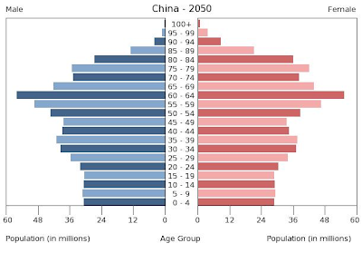 |
| Figure 6: China Population Pyramid 2050 |
Each of these projections come from an update of the Census Bureau’s International Data Base, which includes estimates by age and sex to 100 years and older for countries and other areas with populations of 5,000 or more and provides information on population size and growth, mortality, fertility and net migration.
Since April 2012, users of the International Data Base have been able to obtain population in single years of age, allowing them to calculate country-specific populations in particular age groups (e.g., population at selected ages younger than 5, or adolescents).
Between now and the middle of the 21st century, global population will continue aging. The percentage of population 65 and older will more than double, from 8 percent today to nearly 17 percent in 2050, carrying with it well-established changes in the mix of communicable and noncommunicable disease patterns in populations, health care burden, pension systems, the composition and character of the labor force, and other economic variables, such as savings and consumption patterns.
One world region — Africa — will continue to have populations younger than 15 that are much larger than those 65 and older, but even there, the balance will have shifted toward the older group (see Figure 7).
 |
| Figure 7: Africa Population Pyramid 2050 |
View and Download Data
Want to explore additional population projections by country or region? View the data included in the charts above and more from the U.S. Census Bureau’s International Programs – International Data Base page at: http://www.census.gov/population/international/data/idb/informationGateway.php
This news release was provided by the U.S. Census Bureau with graphics added by the Connecticut State Data Center.

2010 Census of Population and Housing Unit Counts – Connecticut
The U.S. Census Bureau has just released a new report based on the 2010 Census for Population and Housing Unit Counts for Connecticut. This report includes housing units, population by urban and rural areas and more. Several of the tables also include historical census data at the state, county, county subdivision, place, and/or minor civil division levels for Connecticut.
This report provides easy to read tables of data which provides the same data available from the American FactFinder in a streamlined report. This report also includes population density, housing density and additional details which may be helpful to our readers.
Check out the full report at: http://www.census.gov/prod/cen2010/cph-2-8.pdf
The Connecticut GIS User to User Network and the Connecticut GIS Council Education and Outreach Working Group’s latest issue of GeoFocus, CT’s Quarterly Geospatial Newsletter is now available. Included below are just a few highlights from the Summer 2012 (June) issue:
 To provide our readers with a summary of usage trends, the Connecticut State Data Center (CtSDC) and the University of Connecticut Libraries Map and Geographic Information Center (MAGIC) will be publishing a summary report for each month to this blog. This summary report provides our readers with an opportunity to view trends in usage of webpages, examine trends in keyword searches, and will feature a brief overview of projects in development. Included below are highlights from June 2012 which focuses on five main areas: User Inquiries, Web Content Views, Trends in Webpage Usage, Trends in Keywords, and Projects in Progress.
|
Web Resource
|
Total Inquiries
|
Monthly Change
vs. 2011 |
YTD Inquiries
for 2012 |
YTD Change
vs. 2011 |
|
Connecticut State Data Center
|
161
|
35%
|
835
|
88%
|
|
MAGIC
|
128
|
83%
|
849
|
136%
|
|
Total
|
289
|
53%
|
1,684
|
109%
|
|
Web Resource
|
Unique Views
|
Monthly Change
vs. 2011 |
YTD Unique Views
for 2012 |
YTD Change
vs. 2011 |
|
Connecticut State Data Center
|
1,951
|
21%
|
9,492
|
12%
|
|
MAGIC 2.0 Online Maps
|
410
|
-53%
|
3,284
|
-49%
|
|
MAGIC Flickr Collections
|
35,066
|
77%
|
200,313
|
46%
|
|
MAGIC News Blog (Retired)
|
35
|
75%
|
221
|
16%
|
|
MAGIC Website
|
10,622
|
21%
|
75,130
|
10%
|
|
Outside the Neatline Blog
|
953
|
59%
|
5,251
|
49%
|
|
|
||||
|
Total
|
49,038
|
55%
|
293,705
|
31%
|
|
Web Resource
|
Total Views
|
Monthly Change
vs. 2011 |
YTD Total Views
for 2012 |
YTD Change
vs. 2011 |
|
Connecticut State Data Center
|
2, 716
|
9%
|
14,136
|
10%
|
|
MAGIC 2.0 Online Maps
|
3,044
|
-62%
|
28,738
|
-56%
|
|
MAGIC Flickr Collections
|
35,066
|
77%
|
200,313
|
46%
|
|
MAGIC News Blog (Retired)
|
55
|
175%
|
310
|
36%
|
|
MAGIC Website
|
16,474
|
21%
|
118,827
|
12%
|
|
Outside the Neatline Blog
|
1,288
|
61%
|
7,129
|
45%
|
|
Total
|
58,644
|
31%
|
369,467
|
13%
|
|
Page
|
Total Views
|
|
916
|
|
|
579
|
|
|
397
|
|
|
132
|
|
|
124
|
|
Page
|
Total Views
|
|
3,362
|
|
|
2,865
|
|
|
1,105
|
|
|
911
|
|
|
773
|
|
Page
|
Total Views
|
|
166
|
|
|
71
|
|
|
65
|
|
|
61
|
|
|
43
|
|
Keyword
|
|
Demographic Profile Senate
|
|
Family statistics
|
|
06050
|
|
1940 Census Data West Hartford
|
|
Keyword
|
|
Campus map
|
|
parcels
|
|
Appalachian trail
|
|
Canaan
|
|
Elevation
|
V. Projects in Progress – June 2012
Each month the students and staff at MAGIC and the Connecticut State Data Center are working on a series of projects, tasks, data sets, and resources which users typically don’t know about until we add the resource to our website. Included below is a list of projects that are currently underway which will be completed in the coming months and made available in their final forms via our websites.
Each month we will be posting a “Month in Review” article so check back in a month to see the latest information on usage trends at MAGIC and the Connecticut State Data Center.
Each year the Census Bureau’s American Community Survey provides dozens of tables of interesting data related to education – tracking enrollment in public and private schools, the number of individuals holding bachelor’s degrees in various fields, and cross-tabulating educational levels with characteristics as diverse as place of birth, mobility and race. Data on the relationship between educational attainment and income are available in table S1501 of the ACS. Based on the data in that table, the thematic map and chart below illustrate the relationship between education and income, as well as the gap in income between men and women with equivalent levels of educational attainment – from those with less than a high school diploma to those with a graduate or professional degree.

The U.S. Census Bureau has just released a listing of the fastest growing cities between the 2010 Census (April 1, 2010) and the Population Estimates for July 2011. Based on the 2011 Population Estimates from the U.S. Census Bureau the largest percent increase in population from 2010 to 2011 was in New Orleans, Louisiana with a 4.9% increase. When we examine the total number of people rather than percentage, New York, New York added just over 69,777 people, the largest numeric increase in population in cities from 2010 to 2011. Check out the top 15 fastest growing, largest numeric increases, and largest populations cities in the U.S. based on the 2011 Population Estimates below:
Table 1. The 15 Fastest-Growing Large Cities from April 1, 2010, to July 1, 2011
| Percent Increase |
2011 Total Population |
||
|---|---|---|---|
|
1.
|
New Orleans, LA
|
4.9 | 360,740 |
|
2.
|
Round Rock, TX
|
4.8 | 104,664 |
|
3.
|
Austin, TX
|
3.8 | 820,611 |
|
4.
|
Plano, TX
|
3.8 | 269,776 |
|
5.
|
McKinney, TX
|
3.8 | 136,067 |
|
6.
|
Frisco, TX
|
3.8 | 121,387 |
|
7.
|
Denton, TX
|
3.4 | 117,187 |
|
8.
|
Denver, CO
|
3.3 | 619,968 |
|
9.
|
Cary, NC
|
3.2 | 139,633 |
|
10.
|
Raleigh, NC
|
3.1 | 416,468 |
|
11.
|
Alexandria, VA
|
3.1 | 144,301 |
|
12.
|
Tampa, FL
|
3.1 | 346,037 |
|
13.
|
McAllen, TX
|
3.0 | 133,742 |
|
14.
|
Carrollton, TX
|
3.0 | 122,640 |
|
15.
|
Atlanta, GA
|
3.0 | 432,427 |
Table 2. The 15 Cities with the Largest Numeric Increase from April 1, 2010, to July 1, 2011
| Numeric Increase |
2011 Total Population |
||
|---|---|---|---|
|
1.
|
New York, NY
|
69,777 | 8,244,910 |
|
2.
|
Houston, TX
|
45,716 | 2,145,146 |
|
3.
|
San Antonio, TX
|
32,152 | 1,359,758 |
|
4.
|
Austin, TX
|
30,221 | 820,611 |
|
5.
|
Los Angeles, CA
|
27,077 | 3,819,702 |
|
6.
|
Dallas, TX
|
25,413 | 1,223,229 |
|
7.
|
Phoenix, AZ
|
23,815 | 1,469,471 |
|
8.
|
Denver, CO
|
19,960 | 619,968 |
|
9.
|
Charlotte, NC
|
19,663 | 751,087 |
|
10.
|
San Diego, CA
|
18,773 | 1,326,179 |
|
11.
|
New Orleans, LA
|
16,911 | 360,740 |
|
12.
|
Fort Worth, TX
|
16,708 | 758,738 |
|
13.
|
El Paso, TX
|
16,416 | 665,568 |
|
14.
|
Washington
|
16,273 | 617,996 |
|
15.
|
San Jose, CA
|
14,875 | 967,487 |
Table 3. The 15 Most Populous Cities: July 1, 2011
| 2011 Total Population |
|||
|---|---|---|---|
|
1.
|
New York, NY
|
8,244,910 | |
|
2.
|
Los Angeles, CA
|
3,819,702 | |
|
3.
|
Chicago, IL
|
2,707,120 | |
|
4.
|
Houston, TX
|
2,145,146 | |
|
5.
|
Philadelphia, PA
|
1,536,471 | |
|
6.
|
Phoenix, AZ
|
1,469,471 | |
|
7.
|
San Antonio, TX
|
1,359,758 | |
|
8.
|
San Diego, CA
|
1,326,179 | |
|
9.
|
Dallas, TX
|
1,223,229 | |
|
10.
|
San Jose, CA
|
967,487 | |
|
11.
|
Jacksonville, FL
|
827,908 | |
|
12.
|
Indianapolis, IN
|
827,609 | |
|
13.
|
Austin, TX
|
820,611 | |
|
14.
|
San Francisco, CA
|
812,826 | |
|
15.
|
Columbus, OH
|
797,434 |
Read additional details at: http://www.census.gov/newsroom/releases/archives/population/cb12-117.html

The Connecticut Humanities Council has released a new website dedicated to Connecticut History at connecticuthistory.org. This website includes stories about people, traditions, innovations, and events that make up the rich history of the state of Connecticut. Each week new content, connections are added to the site.
The site includes the ability to view content by topics, people, and towns. With a combination of photographs, illustrations, documents, web resources, and more you will want to spend some time exploring the site in greater detail. With an easy to navigate interface, users will enjoy viewing the Connecticut History Towns Page which features images from each of Connecticut’s 169 towns plus links to information pertaining to each town. With the entire website continuing to expand with new stories weekly we encourage readers to view the site weekly and you can following the site from Twitter, Facebook, and even subscribe to the RSS feed for the website.
This website was developed in partnership with the Roy Rosenzweig Center for History and New Media at George Mason University and features content from Connecticut Explored, Connecticut History Online, and The Connecticut Council for Social Studies.
 The Connecticut GIS User to User Network Quarterly meeting will be held on Friday June 29, 2012 from 8:00am-12:00pm at the South Central Regional Water Authority in New Haven, Connecticut. The focus of this meeting will be “GIS Planning, Preparation, and Mitigation for Natural Disasters” and will feature three presentations plus include time for networking.
 The agenda for this meeting is included below:
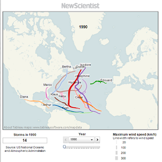
With hurricane season upon us, the New Scientist has developed a visualization of the path of hurricanes for the past 20 years. Explore year by year the path of each hurricane, view the total number of storms for each year, and each visualization includes the maximum wind speed for each storm.
As you explore this article further you will discover that 2005, the same year that Katrina and Rita caused so much damage to the gulf coast, there were a total of 28 storms. These 28 storms in 2005 resulted in just over 1,000 casualties, representing the highest number of hurricane related deaths over this 20 year period.
Review this article and view 1990-2010 Hurricane Visualizations at:
http://www.newscientist.com/blogs/shortsharpscience/2011/05/prepare-for-hurricane-season.html
 Want To Explore More Hurricane Data?
The National Oceanic and Atmospheric Administration (NOAA) has developed an interactive interface to enable users to explore Historical Hurricane Tracks which can be explore by location, storm name, and ocean basin. This interface allows users to view storms from the late 1800s to present and includes barometric pressure readings, wind speeds, storm category, and more details plus the ability to download the data. This visualization can be viewed at: http://csc.noaa.gov/hurricanes/
The NOAA Historical Hurricane Tracks also allows users to refine their search by storm category, time frame, and even barometric pressure. This interface provides great visualizations of the life cycle of a hurricane and provides an interactive display of the path of the hurricane.
More Resources to Explore
Want to explore more details about hurricanes and historical hurricane visualizations? The following links include some additional resources related to hurricanes:
