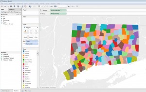
This is the second in a series of posts on using Tableau Desktop or Tableau Desktop Public Edition to map Connecticut data using custom polygons, to accommodate geographic entities not recognized innately in the Tableau mapping functionality. See these other posts for more information on creating filled maps for Connecticut towns and school districts in Tableau:
The U.S. Census Bureau aggregates and publishes Decennial Census and American Community Survey data at geographic levels large and small, including Census Tracts – small statistical subdivisions of roughly 1200-8000 people. Connecticut has 833 Census tracts; many small towns comprise a single Census Tract, while Hartford has more than 30. There are more than 7,500 data tables available through American FactiFinder for Connecticut Census tracts on demographic and economic measures including income and poverty, educational attainment, health insurance coverage, housing characteristics, and more. The steps below will let you create a choropleth map in Tableau for any Census Tract-level data downloaded from American FactFinder, enhancing the functionality of Tableau to analyze and visualize ACS and Decennial Census data.
Tableau support documentation includes instructions on converting ArcGIS shape files into spreadsheet files that Tableau can use to construct custom polygon maps. The Connecticut State Data Center has converted a number of U.S. Census Bureau TIGER/Line shape files into polygon data files for use in Tableau, including polygon files for Connecticut towns, school districts, Census tracts, and legislative district boundaries. If you would like to visualize Connecticut Census Tract-level data on a map (as in this dashboard) in Tableau, this Excel workbook:
CT_Census_Tract_Polygons_for_Tableau.xlsx
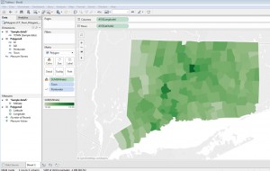
of Connecticut Census Tract polygons contains a Polygon spreadsheet that will render a map of all Census tracts within Connecticut, and an additional sheet of housing value data from the American Community Survey that you can link with the polygon map, following the steps below, to create a choropleth map like the one below (click image to see full size). Additional information will help you download more tract-level data from American FactFinder, and join and map it with the Polygon data.

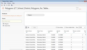
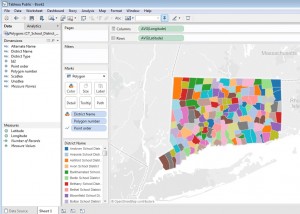
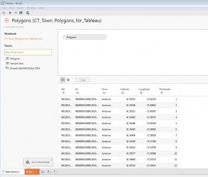
Each of the 29,202 rows of the Excel Polygon sheet describes a single point on the outline of a single tract’s boundaries, with a field for longitude and latitude of the point. Another field for each row is Point Order, which tells Tableau in which order to ‘connect the dots’ to form each tract on the map. For example, Mansfield’s shape has 208 points in the data set. Tableau draws each polygon by starting with the latitude and longitude of point 1, then continues drawing the shape until it gets to point 208, completing the outline of the town. The software does this for all 29,000+ points on the map instantly, whether in Tableau Desktop or Public, and map tools seem to work as quickly with a polygon map published to Tableau Public as any boundaries innately recognized in Tableau.
Step 1: Setting up the polygon map:
Continue reading →


